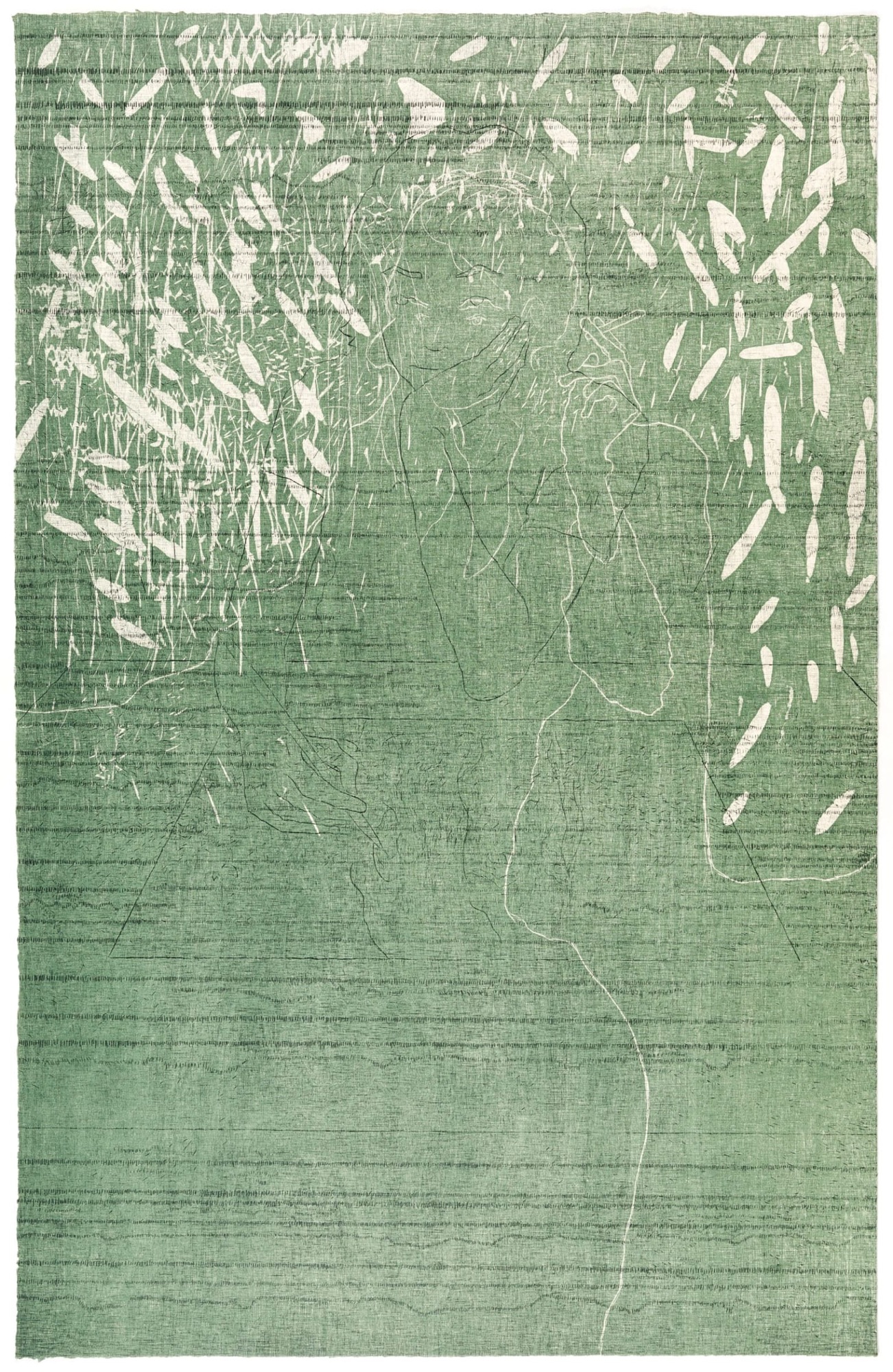
Van Doren Waxter is currently presenting Jeronimo Elespe: Woodcuts, Etchings and Monotypes, an exhibition of new prints. Celebrated for his dreamlike, optically charged paintings, printmaking has always been a vital part of Madrid-based Spanish artist, Elespe’s practice.
Steve Roden was a wildly influential and respected artist and musician who passed away from Alzheimer’s disease last September at the age of 59. floating over the silent world (which Hyperallergic says is one of the 10 Art Shows to are in Los Angeles this August) pays tribute to his legacy with a selection of lesser-known paintings, drawings, and sculptures created between 1990 and 2019.
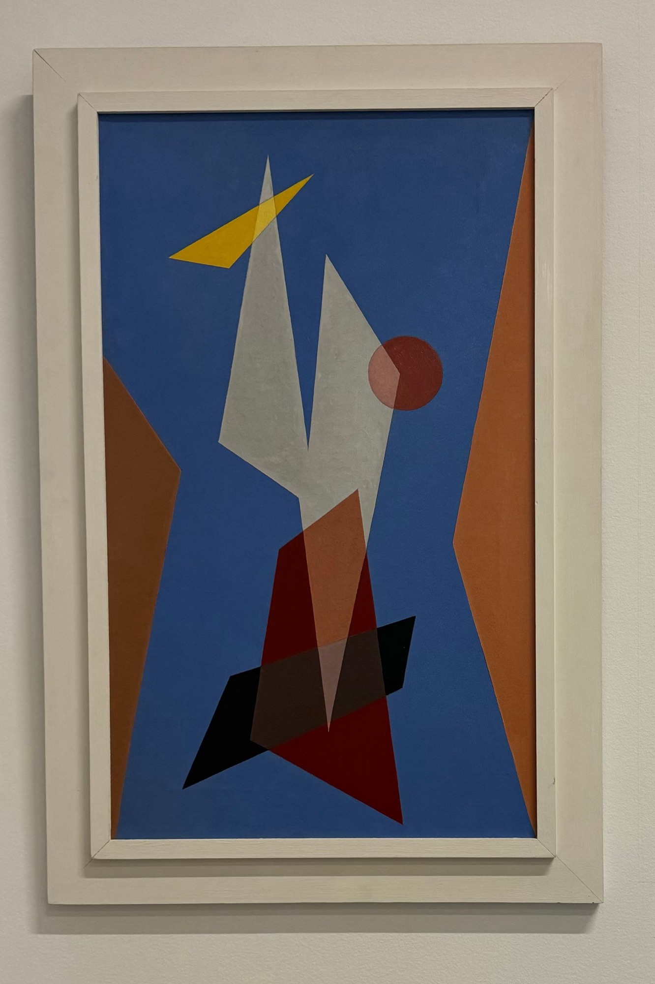
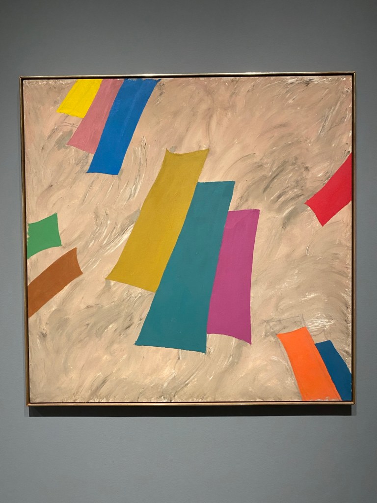
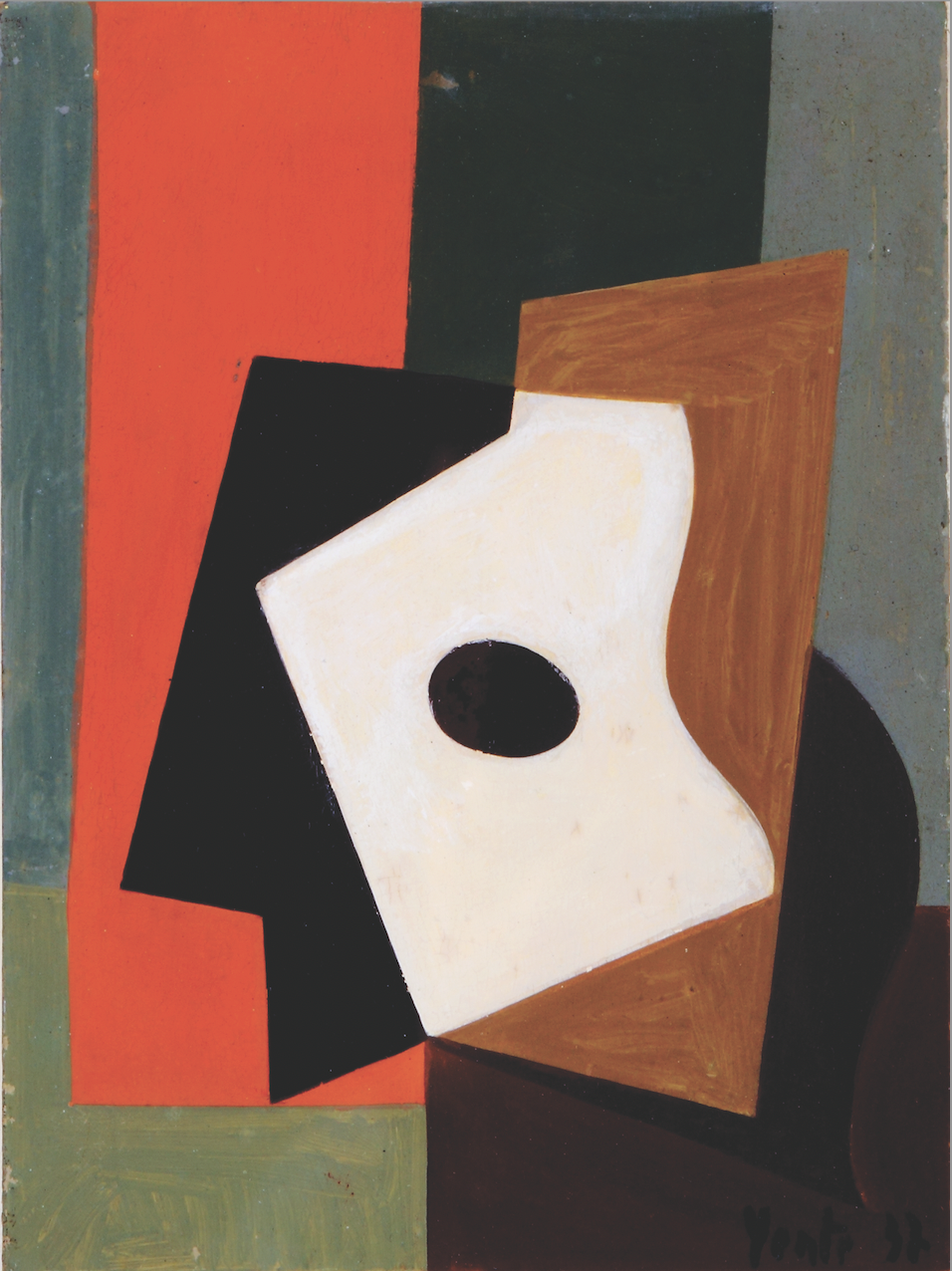
A friend who likes to test my art history knowledge sent me the image below, which is at the de Young Museum. As a key figure in early American abstraction, Charles Green Shaw was a unique amalgamation of a multifaceted life, education and career that resulted in a significant and beautiful body of art. Shaw holds the special recognition of being the only American born artist to be awarded two solo exhibitions during his lifetime at Solomon Guggenheim’s Museum of Non-Objective Painting (which eventually became the Guggenheim).
Burnaway takes a close look at Space Makers: Indigenous Expression and a New American Art at Crystal Bridges Museum of American Art, Bentonville, in which Linda has work.
Brett Levine Two Coats has words about Sara’s immersively curved space “Environment: Structure/Sound III” (first exhibited in 1979, the 2024 incarnation is at the Alabama Center for Architecture). Levine- (it is) “a poignant reanimation and re-imagination of post-Minimalism as a practice.”
Gloria came of age in 1970s New York and played a vital role in many artist-based initiatives in SoHo and on the Lower East Side. Her paintings can be read as Minimalist, Conceptual, and systems-based, but they are also indebted to the burgeoning support for “women’s work,” the Pattern & Decoration movement, and the Criss-Cross artists. Hyperallergic said Unwinding Unbinding at Anat Ebgi was one of the 10 shows to see in Los Angeles this June.
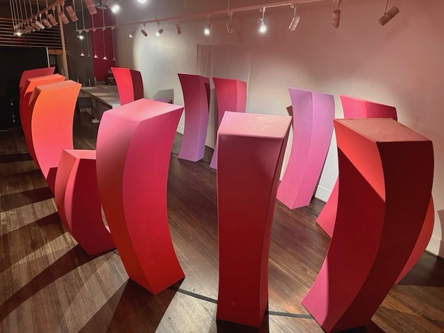
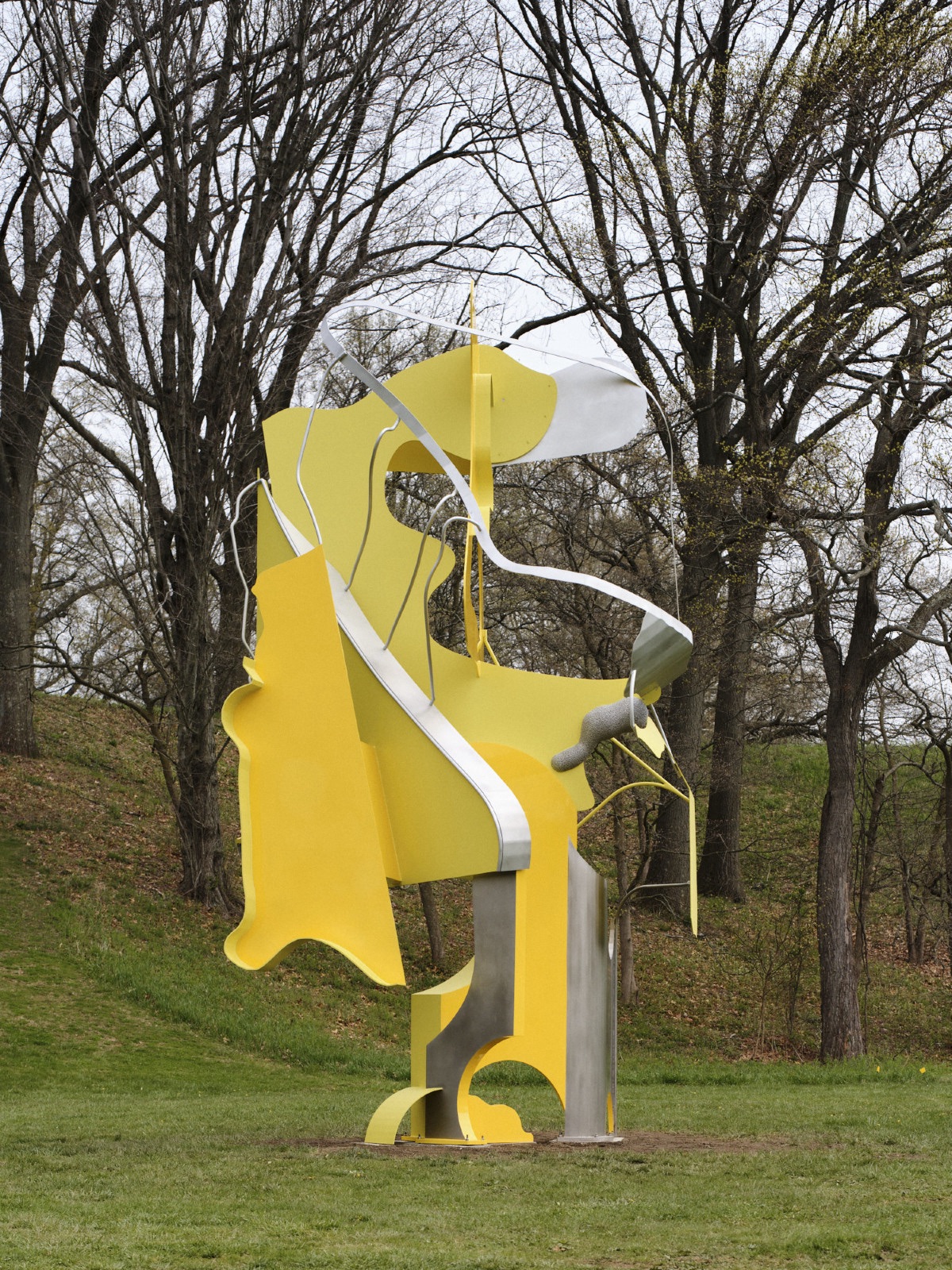
Storm King Art Center recently opened the exhibition Arlene Shechet: Girl Group, which brings together the artist’s recent work in wood, steel, ceramic, paper, and bronze with six new monumental sculptures created for the center which harness the expressive power of geometry, line, color, and form in works displayed across Storm King’s hills, fields, and galleries.
Tom Nichols, writer for the Atlantic, is as a child of the 1960s, and he says in a recent newsletter article titled “The Lies Nostalgia Tells Us“* that “those days weren’t better—but in one way, they were sweeter.” *There is a pay wall for this link to the article (unless you’re a subscriber), but if you are an Apple News subscriber, this link will open it for you. I find Tom interesting (I am a more-left-than-center progressive, yes I made that up) because he is as far to the right as I can handle, frankly. Something about perspective. Also he absolutely rails on MAGA world which, given his facility with writing, is delish. Anyway, about this recent newsletter on the topic of nostalgia. tldr; he explains what he means by talking about childhood memories that are sweet. As a child of the 1980s, I get that- it’s a sort of un-complicated-ness (because childhood, duh).
I was reminded when reading that word- nostalgia- of a blog I wrote almost a year ago about the topic of color. I also touched on the idea of nostalgia in that piece (pin) because I was beginning to explore an interest in the parallels between the cultural moment of the 2020s and late modernism (which I developed a little more at the end of that year). To summarize, I teach my students that Modernism can generally be understood as a reaction to Classicism, and a belief that a re-imagining of human culture was necessary and imminent. Very simplified of course. On to that pin = the specific reference to nostalgia was this Jonathan Stevenson essay at Two Coats in which he discusses how nostalgia that’s basic (yes I mean it that way) romanticism is the “dumb” variety. Not the same message as Tom and also parallel.
Yes I got to “and”! It just comes up all the time. “Yes” Tom and I have tender memories of childhood, and, it’s a lie to believe that time in our history was better. Same thing for Modernism- yes it was necessary change and the idea of universal human worth is great, and… it sure wasn’t a clean break from misogyny, racism and classism either.
Also, I gotta say, it’s pretty wild to read that I wrote, basically, “hey our situation today is sort of like the Modernists in that nothing about the old way of doing things works anymore” a year ago and wonder at how different things are in the US and the world one year later. Wow.
Saw below recently at the Ackland Museum- like the piece I noted from Jack, it is included in Arranged: Recent Acquisitions of Modern and Contemporary Paintings. Frank is known principally as a pattern painter employing low relief in his works. Influenced by his Hudson River Valley surroundings, he was also an accomplished drawer of landscapes and subjects from nature. He proceeded gallery owner, Lee Hansley, as a curator at SECCA.
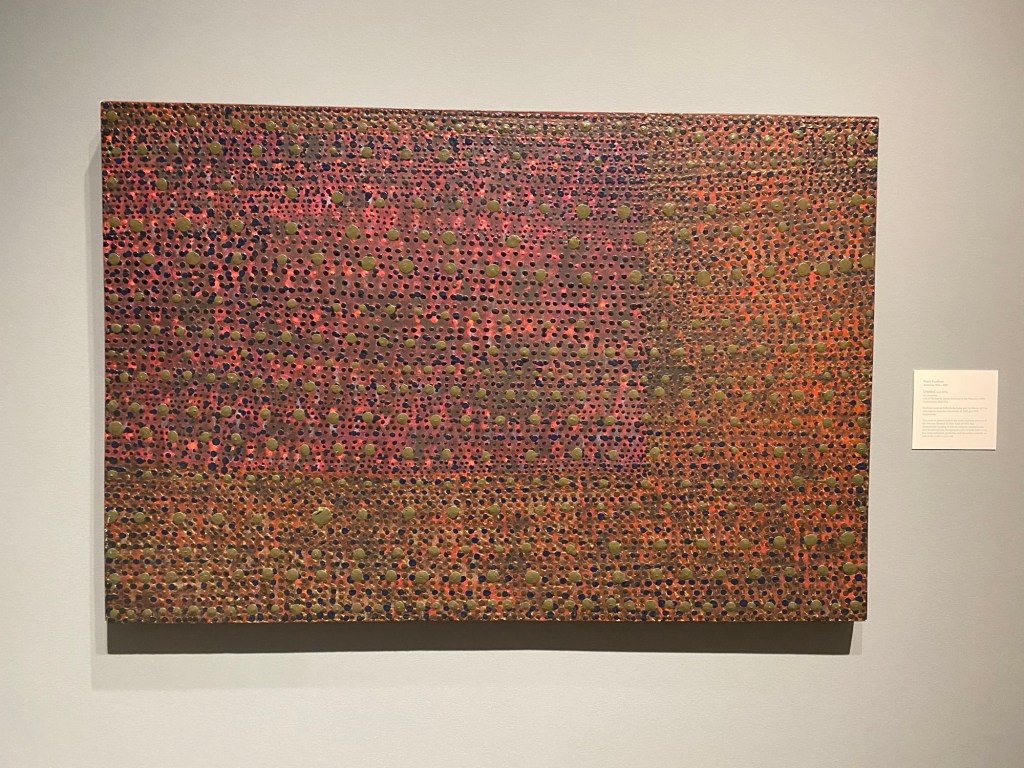
has work featured in Vorágine: Yente and Cecilia Biagini. Inspired by traditions of South American abstraction, Cecilia makes paintings, mobiles, photograms and reliefs that flow seamlessly from medium to medium. Utilizing a bold sense of color, line, depth and abstraction, the varied works find commonalities in their composition and playfulness. Evoking ideas of physics, the geometric shapes in her work are arranged in a manner suggesting movement and animation.
Vorágine: Yente and Cecilia Biagini brings together modern and contemporary abstract artworks by Yente (1905–1990), a pioneering figure in abstraction from Argentina, and Cecilia Biagini. The exhibition will present a selection of works by Yente from the 1930s through the 1960s, in which the artist experimented freely with the visual languages of the international avant-gardes by working across mediums, figuration, and abstraction.
Les Yeux du Monde is currently presenting Influence + Conversation, an exhibition of new work by Barbara and Isabelle- the latter studied with in the MFA program at UNC Greensboro. Isabelle’s work, grounded in direct observation of her surroundings in central Virginia, distills the essence of her environment into compelling oil on canvas compositions (some of which are more abstract than others).