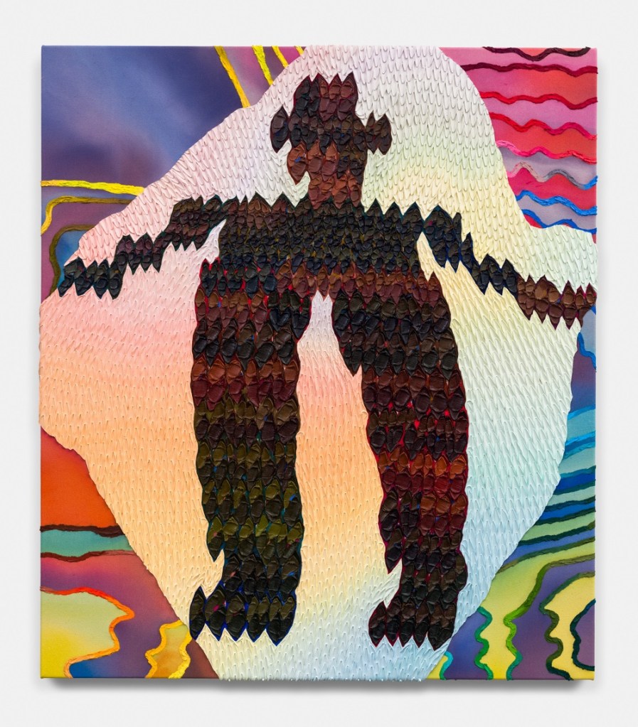
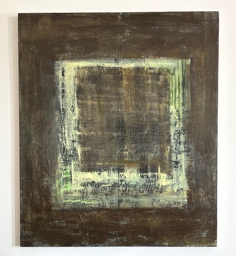
Marion Griese

work is orchestrated with a collection of colours, shapes, and lines that have caught her eyes as she moves through daily life. These elements have slowly become the vocabulary she uses to tell her stories and give shape to her personal impressions of the world around her. Her hope is that her art becomes a space for the viewer to transcend the moment and to experience a sense of relief and inspiration, as a favourite piece of music might.

#mariongriese

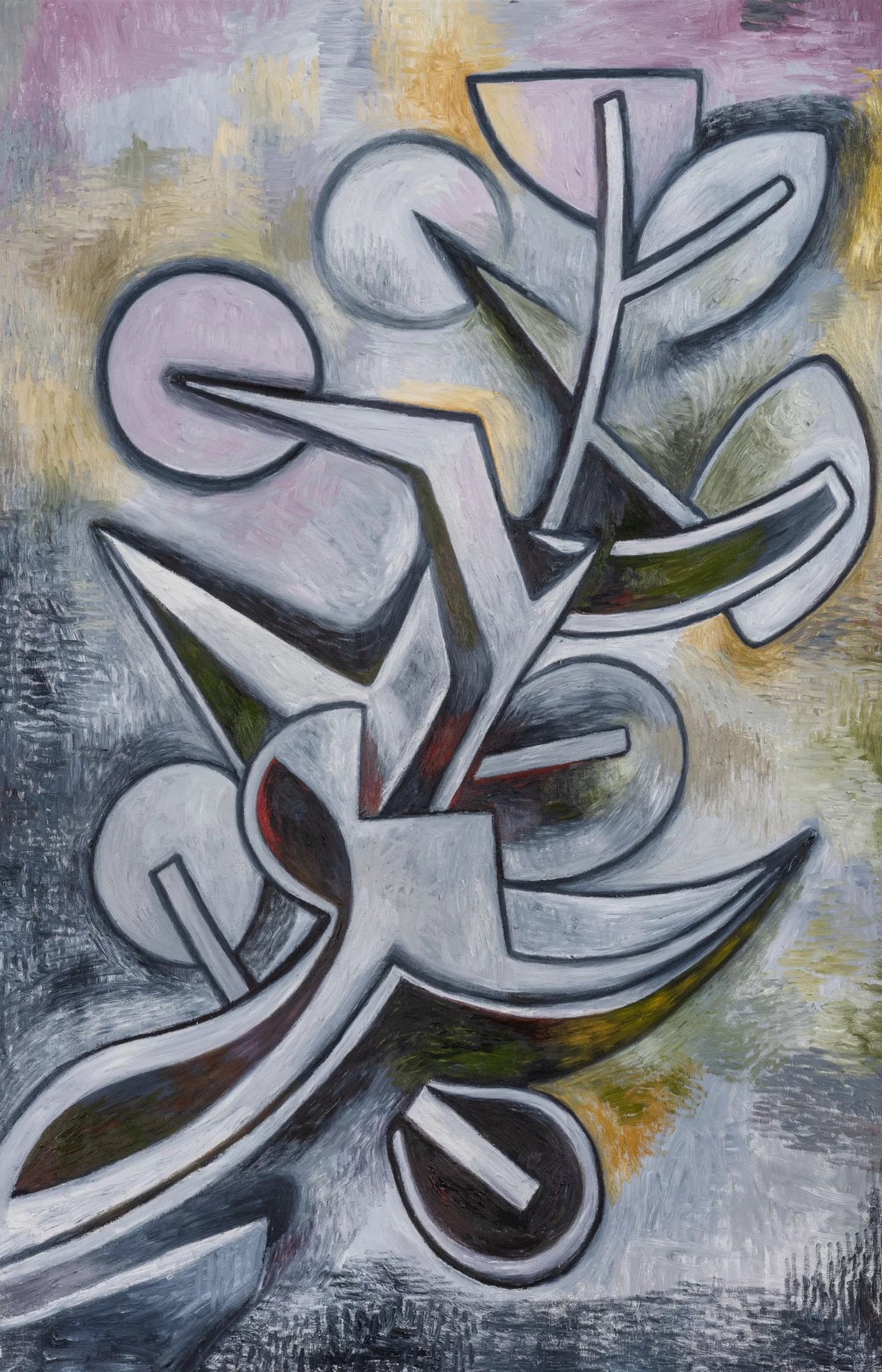
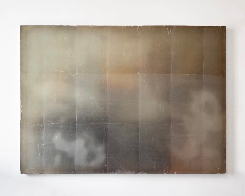
Gwenaël Kerlidou

has actually been mentioned here before, when he wrote for TUSSLE Christopher. They’re also a good writer: (from his statement) “Abstraction, now more than ever, has become an exercise in painting in tongues, pulling both painter and viewer toward a practice of highly idiosyncratic systems of signs, and paradoxically seems to be at the moment one of the best tuned visual instrument to explore our diverse commonalities.” He is one of the ten artists Saul Ostrow included in Building Models.

More (yeah I know, they’re pretty fantastic)

#gwenaelkerlidou

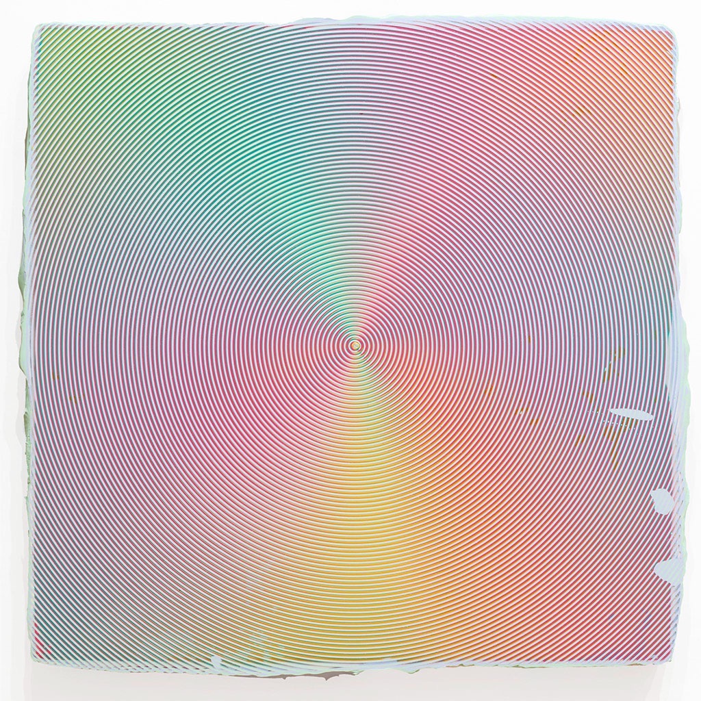
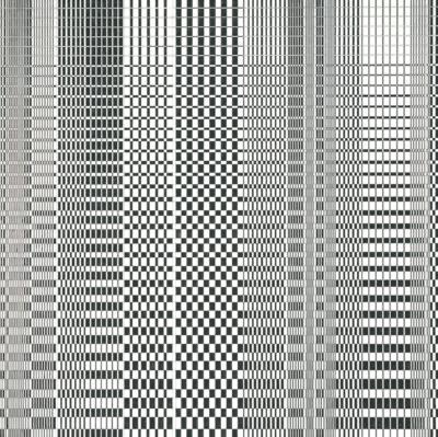
Ted Stamm

is one of the 10 artists included in Building Models: The Shape of Painting at the Painting Center which is recently referenced in another blog. Stamm’s work are fully abstract, and it is unnecessary for the viewer to know the origins of what he or she is looking at in order to experience them the way the artist intended. Black is a consistent component of Stamm’s work, a color that he associated with rebellion, rigor and reduction.

More

#tedstamm

Countours

Over at Two Coats of Paint regular contributor David Carrier has words about “Building Models: The Shape of Painting,” currently up at the The Milton Resnick and Pat Passolf Foundation and curated by Saul Ostrow (who gets mentioned on this blog occasionally. Carrier titled his piece Art History Diagrammed.

In another essay I suggested any conception that Artists or the Arts or whoever needs a master narrative to give Art meaning lacked veracity and further that the reverse is true- any possible narrative only comes after we have a sense of the meaning of what we all did. So once again I was feeling a little cantankerous as I started to read, but not much, because critics’ and historians’ job is to try to throw this very structure around all the things. If you don’t truck with this interpretation of their role just open another tab and search for the word “history”. This article will be here when you get back.

Carrier notes that those of us old enough to remember Claude Levi-Strauss’s books on structural anthropology or Rosalind Krauss’ famed structuralist account of sculpture will appreciate the show. Their reason seemed good so I read the latter- both of these writers were covered in one or more of my undergrad classes, for certain. I confess I didn’t plow all the way through since I wanted to get back to David’s words and understand the connection, and you’ll hear from me at another time about Kraus’s expanded field concept (probably as a reason to revisit structures I have made up out of whole cloth myself).

I know most of the ten artists Ostrow has included, and one of the reasons for this blog’s existence is the joy I find in “discovering” creative practices, and so I will blog about those we haven’t discussed yet over the next week. Pat and Milton made important contributions to history obviously, and the foundation named for the same plays host to the subject exhibit which features work by Ron and Joanna and Joe, the latter being, in my opinion, a painter who was overdue for a retrospective and got one earlier this year at the Menil in Houston. The take away is that the grouping are creatives who have made their mark, which I note because I do think our read of their work, each time it happens going forward, is a read on ourselves. Not a justification per se, although over time maybe some creative re-telling… The point being the notion that this show is about the arc of history is not overreach, there is skin in the game.

Carrier understands this exhibit is part of a larger body of “work” by Ostrow to draw the contours of a very specific point in Art history, for Saul’s own reasons. Spoiler alert he thinks the conceit that there is a master narrative to be had is a bit forced. To generalize, I’d offer that any creative would agree that while we all take in what is going on around us that we also very much have our own ideas of what we are about and which I doubt anyone who calls themselves Artist with a capital “A” feels obliged to check with the literati regarding. As I said at the top, the contour often takes the distance of time anyway (which in fairness, Ostrow has) and any diagram is at best helpful and always artificial. tldr; my perspective about Carrier’s intent did not serve me in the end, as we seem to be aligned on that point. Also and, the show has some great looking work in it which he recognizes so if you’re NYC based go check it out.

Speaking of contours, I remember a moment in a critique in grad school which like too many of them for my taste went sideways, and in this case, involved a retort by yours truly that the expectation that Artists should consider at all times that their practice could and should be part of the canon was folly. I literally can’t remember what prof had goaded me into this exclamation, but it stands out as a moment when I realized that I truly believed Art as a historical project was over, or at least pointless (yes, “dead”) and that we should all proceed as lead by the spirit. And yes, I had recently finished a good number of Arthur Danto‘s essays (link is to a great overview vid by Amor Sciendi on his YouTube channel).

Clearly the volume of words I’ve left here and elsewhere illustrate that I do not feel the limited value of a master contour detracts from the value we can find in our own practices, or even in drawings lines of influence (before or after the act of creation) to our collective history. Just search for the word “Modernism” on this blog if you’re new and curious how I think about what I’m doing here in relation to events from our past. Cheers.

Mindy Shapero

Shapero transmutes negatives from past sculptural pieces into positive shapes that form the bedrock of her cosmic abstractions. Shapero’s repeating motifs—irregular rectangles and ovals that resemble “scars” or ruptures in the surface— are highlighted through the artist’s application of delicate gold leaf, an adornment dating back more than 8,000 years in the canon of art history.

#mindyshapero

Nonfigurative Maximalism in a Time of Multiplicity 

Those of you who read which I suspect is most you, may take a pause at this essay’s title, wondering where you’ve heard this phrase recently, or at least something very similar. You’d be correct of course. Hyperallergic recently published Geometric Abstraction in the Age of Disparity, a review of Lisa Corinne Davis’s newest work by the one and only John Yau.

Lisa has been hitting for a minute, and if you’re a fan of abstraction you can see why. Tight, right? I’m glad to admit that I dig artists that roll up their sleeves and really focus on high craft. No need to pretend like we don’t just. love. really sharp painting. I mean, look at these! She’s got chops, period.

Lisa also has a broad definition of practice, which I appreciate- in addition to making, she teaches, curates and writes. So we share that as a point of fact and no I’m not equating the success or rigor or importance of my practice to hers. And, regular readers also know what a huge John Yau fan I am (I’ve referenced his essays on this blog no less than 15 times). He (and Lisa) do, I think, an excellent job of recognizing the relevancy of openness and intentional rigor around identity while also making time in their practice to address ideas of universality of human experience. This is no mean feat- snaps all around.

With a set up like above, you know the “however” is coming, so, here it is. When I read things like “stretched the possibilities of painting into a territory defined by digital systems, algorithms, flow charts, and diagrams” I just smirk. Not laugh, more of a self-righteous grin. Those of you who know me irl can probably picture the left side of my smile creeping up. Thanks to everyone who says thank you for my words, here and in shorter format over on IG, which I will continue to enjoy giving away for the love of it*. And, a serious art writer has to put some smack down now and then because that is what criticism is. So, let’s try this serious thing on for size.

Put a pin in the notion that the medium of painting can meaningfully comment on “the digital” (and leave that pin in the wall, and never come back to it). Brass tacks- denizens of the capital “A” Art world pontificating about flow charts and diagrams is amusing if I’m feeling generous. If you can’t write a nested IF function in MS Excel or even change out the style on a flow chart in PowerPoint I think you’re out over your skis on the topics that have to do with the world of business, friend. I’ve never once been working on a project pro forma or critical milestones in a digital format and come across anything that in any way shares aesthetic with Lisa’s work. Never.

Geometry is, no doubt, a system of rules. And, Lisa is no doubt interested in systems and their semiotics and how that literally shapes the way we see the world (key word being “see”). I just… I just don’t buy the notion that Lisa’s work is “about” geometry, just because it has some straight lines and squares. Hyper graphic maximalism is more appropriate and that is all love, as I shared above. Keep cranking it out; also and, keep it real, folks.

Why do I like “multiplicity” better than “disparity”? Well let’s start with the fact that John admits multiplicity is present (“they welcome myriad narratives without ever settling into a single storyline“) and the gallery, Miles McEnery, points it out in the show statement (“her works are several things at once“). Disparity is “a noticeable and usually significant difference or dissimilarity.” I’m pretty certain that the cacophonous quality of Lisa’s work doesn’t really make one notice significant differences; maximalism is conflation as its most overpowering. Multiplicity, is, simply, the state of being various. Am I nitpicking? No, I think the distinction that these works aren’t “about” highlighting differences using geometry to comment on algorithms is worth a moment of thought for all of you. I think Lisa’s really well executed, thoughtful and engaging works capture this moment of the flattening of culture and the firehose that is digital media in a way that is eerily comforting. Like that uneasy but familiar feeling of being sucked into… whatever it is. Feeling resentful of something that has power over you is “several things at once.”

I think it all comes down to my gut feeling that when writers, even great writers like John, start describing artwork as being “about” anything, you simplify a piece of Art, reducing it to a mere container, at best a codex, a sort of proxy that only exists to give us a reason to congratulate ourselves for ideas that are more important than the work itself. I understand words are the writer’s bias. And, stop it.

*BTW, in the link above I referenced a prior essay where I shared thoughts about an essay by Hakim Bishara to whom I must offer congratulations, I know we all look forward to them taking on more responsibilities at Hyperallergic.

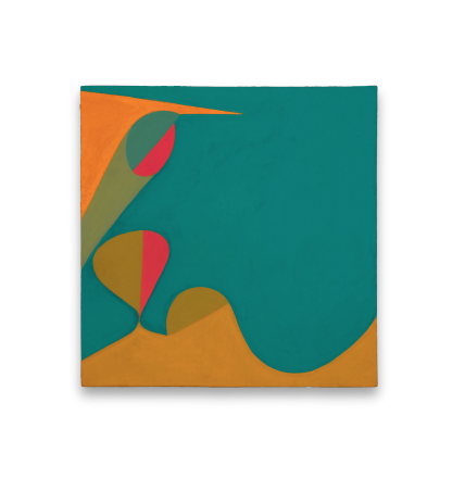
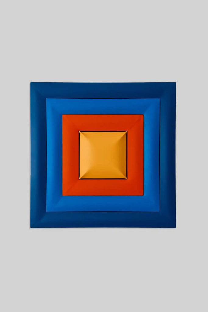
Paul Feeley

Sharon at Two Coats notes a major shift in Paul’s work evident in a (posthumous) exhibit at Garth Greenan. She notes that today when artists work freely across all mediums and platforms, “the measured boundary-crossing that Feeley undertook in the 1960s may seem quaint. Still, there is something durably refreshing about his conviction, then iconoclastic, that undulating lines and shapes could convey a robust sense of humanity, and that even hard-edge geometric shapes could convey emotional content.”

More and more

#paulfeeley