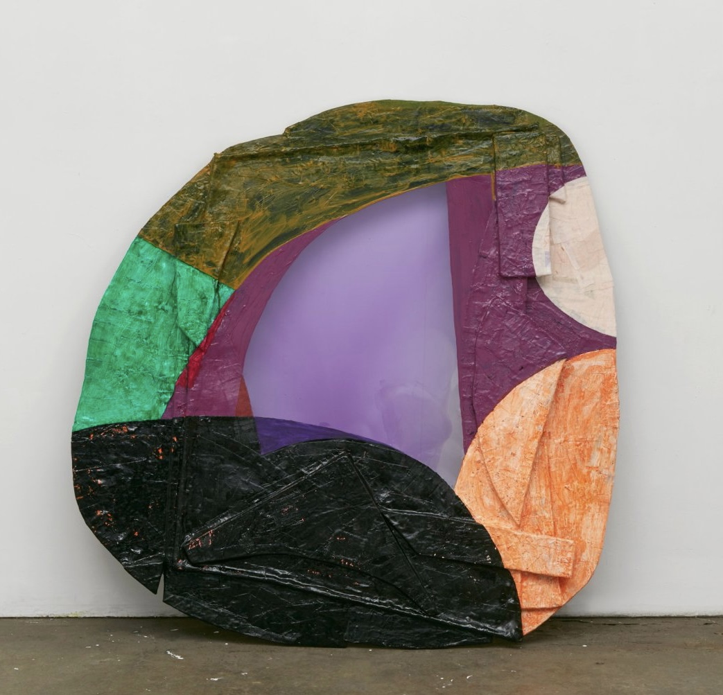
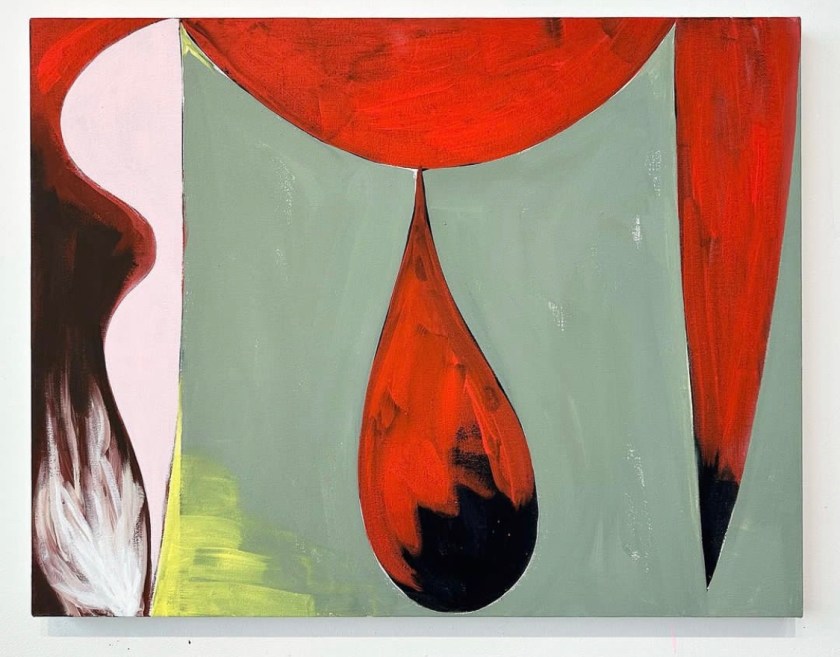
Jackie is interested in creating paintings that bring together a wide multiplicity of sources into a coherent – and sometimes discordant – whole, an attempt at a “unified field theory” of painting.
More
#jackietileston

has technically appeared on this blog because she wrote about Kim. She is one of several artists MONO PRACTICE has included in Resonant Space.
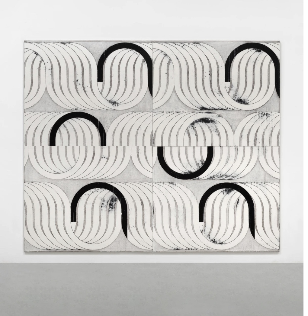
#karenschifano
The Painting Center is pleased to present Sue Havens: Motherboard. This exhibition features large collage relief paintings, works on paper, paper constructions, and ceramic sculpture. Works for Motherboard began by rolling up finished task lists during virtual faculty meetings in the spring of 2020. Other ephemera related to being an artist, mother, and professor was incorporated into the process. The heightened anxiety of the pandemic and the relentless pace of applying for tenure were absorbed into tightly rolled regurgitated balls and began to find their way into paintings. Other material sources include junk mail, supermarket circulars, origami experiments, holiday wrapping paper, fast food bags, report cards, recreation center puzzles, tests, and PTA fliers, finding footing on supports made from Amazon boxes. Paintings on paper also evolved including collaborations with her son.
#suehavens

If you are looking for the newer version of this post it’s here.
Two Coats of Paint discusses The March of Abstraction in the context of Nola’s newest.
More
#nolazirin
Terrell James is an abstract painter who exhibits nationally and internationally. She produces both intimate canvasses and vigorous mural-scale works in oil. James’ works on paper include drawings, etchings, lithographs, monoprints, and monotypes. Her paintings are interpretations of landscapes, internal and external. James has continuously sought unfamiliar environments in which to paint, producing works in place that attend to an area’s specific local light, color, tone, and history, and allowing the disruption and new material to change ongoing work in her home studio in Houston.
#terrelljames
like Lily is resounding, variegated, leaves at Mrs (Two Coats of Paint has words). More
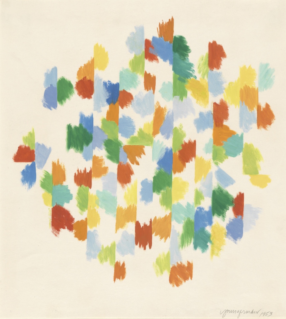
#fabiennelasserre