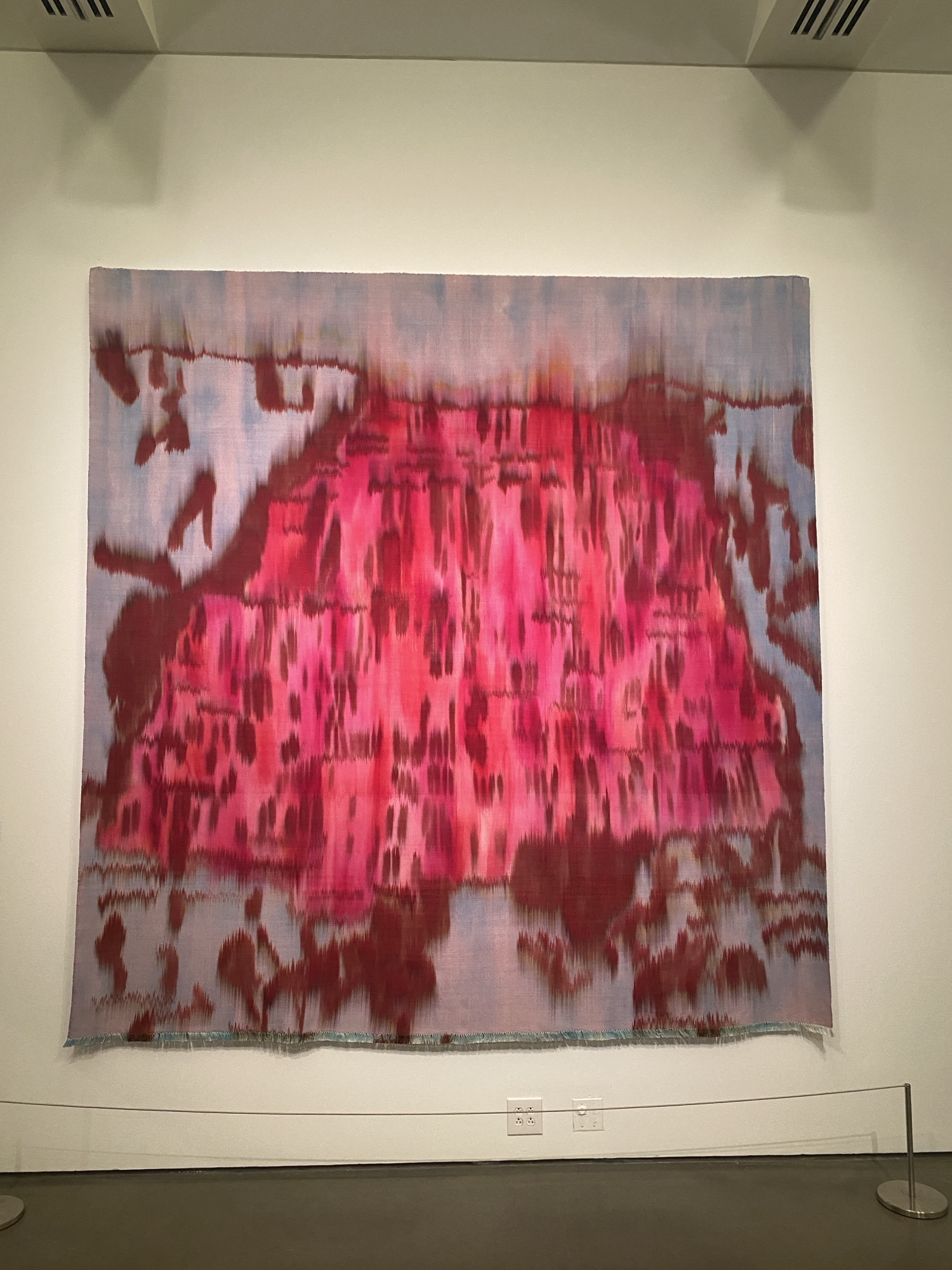
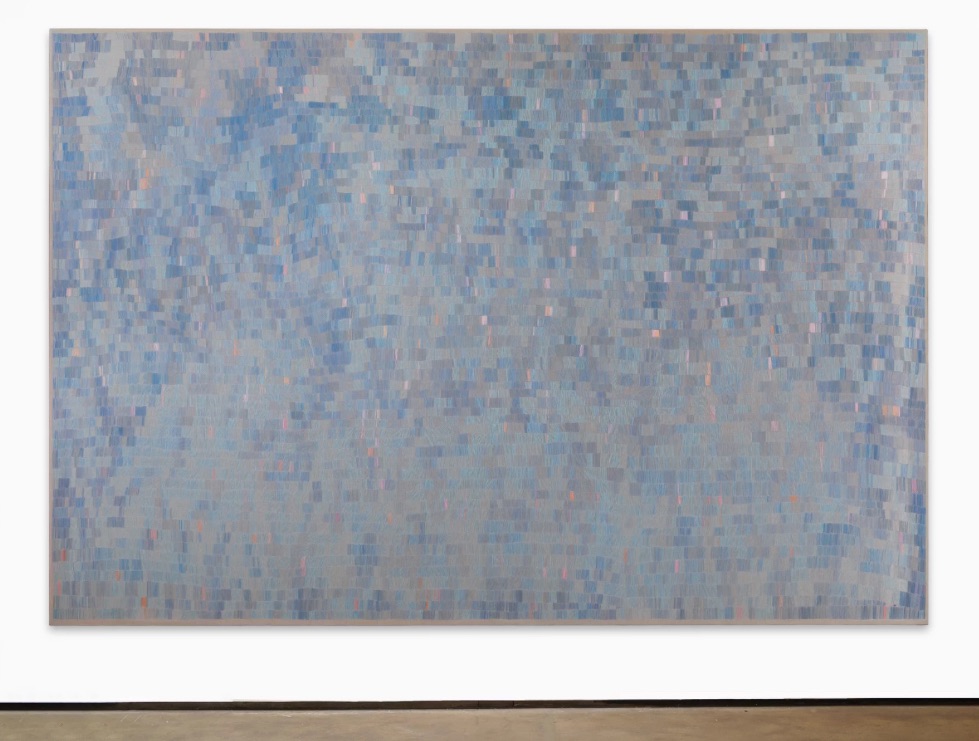
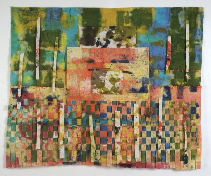
David at Two Coats ties Martin’s current “endless” paintings to Simon and Alix.
#martinbarres

Natasha at Two Coats of Paint says David’s new work at JJ Murphy “hums with a vibrancy akin to a whispered secret, the method hushed but the message direct. The surfaces are matte yet rich, frequently evoking a hint of caramel. Most often the palette is Morandi-muted, and the subtle juxtapositions could only come from a dedicated eye.”
#davidhornung

was in the Zurich Concrete school along with Verena (and others) which was one of the staunchest formalist movements of the last century. Bill said their Art “without external reference to natural phenomena or their transformation” and that it was “the expression of the human spirit, intended for the human mind, and it is of that sharpness, clarity and perfection that must be expected from works of the human spirit.”
#maxbill

I encourage my students to pick at least one abstract art work that resonates each week and wrote a few sentences about it. One of them chose Lyubov recently (reminds me of Arthur). Popova was one of the first female pioneers in Cubo-Futurism. Through a synthesis of styles she worked towards what she termed painterly architectonics.
#lyubovpopova

recently juried and curated This is the Future of Non-Objective Art! at Atlantic Gallery which has quite a roster (Amy is included among others I will be learning and blogging about soon). Brian at Sound & Vision did a pod with her recently also.
More
#suzanshutan

Born in 1912, Swiss artist Verena Loewensberg was a leading figure of the influential Zurich school of concrete artists. The only female member of the group, which also included Max Bill, Camille Graeser and Richard Paul Lohse, Loewensberg distinguished herself through her oeuvre’s formal and chromatic flair. In her work, structured oil compositions are animated by wide-ranging color and shape, yielding a precise yet poetic art. Hauser & Wirth has organized Kind of Blue to celebrate the same.
#verenaloewensberg

Arthur explores the mystery of consciousness as well as the marriage of physical bodies & spiritual energies of humans, animals, and nature. In his figurative works, various techniques are used as bottom layers or the “skins” of his subjects. He applies anywhere from 4 to 15 layers of clear resin between layers of acrylic paint, cut paper, pigmented inks, and spray paint to show depth, creating a 3-D effect. His artistic process is a modern alchemists’ dream, involving years of careful experimentation to perfect and achieve.
#arthurbrouthers

Curator Alexis Lowry traces the playful quality of Charlotte’s sculptures, drawings, and photographs, illuminating their connections to her Minimalist contemporaries along with broader socio-political concerns on Dia’s blog in the context of “Charlotte Posenenske: Work in Progress” which he curated.
#charlotteposenenske

has not always made abstract canvases. “All paintings are self-portraits,” Beckman once said. “That’s all really good painters do . . . that’s the part of painting that you can’t teach.” After a successful career as a fashion designer, Beckman emerged as a post-neo-expressionist artist in New York City alongside artists like Ashley Bickerton and Ross Bleckner.
More (yes, below reminds me of Twombly, too)
#fordbeckman

As I recently blogged I have started to shift some of the focus of my practice to material reuse, with the addition to content being, I think, landfill waste diversion and more specifically, avoidance of methane emissions. Since the work pictured in the link above, I’ve created the work below, which has three layers of glass inside a frame of dumpster-rescued framing lumber. While at first I felt compelled to try to pound the square that is cube into the circle that is oh never mind… anyway, contradiction of materiality is still present I believe, as well as choice and chance (any time one cuts through a piece of wood you reveal something that isn’t known in advance).

I’ll freely admit the composition makes it hard to not think of Josef Albers famous Homage to the Square series. Alber’s teaching has a lot of influence on me- I use many of the exercises out of Interaction of Color when I teach. There’s already a lot of links in this blog so if the reader isn’t familiar with any of this maybe just stop and Google for the next six hours. Seriously. Have fun!
There is of course an Albers entry on the Guggenheim’s site- their/his page has this quote “The optical effects Albers created—shimmering color contrasts and the illusion of receding and advancing planes—were meant not so much to deceive the eye as to challenge the viewer’s faculties of visual reception. This shift in emphasis from perception willed by the artist to reception engineered by the viewer is the philosophical root of the Homage to the Square series.” Albers was also apparently very spiritual, having at one point said “Good to know that rubies have depth. But more to see that pebbles are miraculous.”
I’ve written about the value of contemplation and awe on this blog, so all this feels right in the strike zone. And since I came through art school during the postmodernist wars of the ’90s I’m all good on quotation/appropriation blah blah blah moving on. However, this last week I really felt myself getting hung up on the word “homage,” given the definition- while Albers no doubt meant “expression of high regard : respect” the word drives from an older practice, “a feudal ceremony by which a man expresses allegiance as the vassal of a lord.” Respect I can do, no prob- I think there’s even a nice tie-in between homage and reverence, in the context of Albers spirituality and (this artist’s perceived need to) hold humanity and our continued struggle through and towards valuable enough to have… faith and maybe practice something like devotion? However, as a child that grew up in the doctrinaire environment of an Evangelical household, allegiance is a bridge too far (my afore-mentioned post-structuralist indoctrination education notwithstanding).
The issues I am (was?) having with positioning really came to the fore for me this week with a recent post by Laurie at Two Coats about an exhibit of Noland, Stella and Olitski that was cancelled at the last minute. tldr; I demurred and my (hot) take is/was that the museum in question missed an opportunity by passing on a planned exhibit to hold both truths- that the mores of many late Modernists were exclusionary and they themselves were not diverse or valuing of the same and that their work can and does hold relevance to history and contemporary audiences. To close the loop here, I’m thinking and writing about this topic because I know Albers was not an ally, forgiving him for the time in which he was raised aside. He apparently sexually assaulted Audrey Flack at Yale (I first learned about his misdeed through this Hyperallergic podcast which, like Ms Flack, is amazing for a lot of reasons, her revelations about his abuse and my own struggles to continue to use his text for teaching afterward notwithstanding).
So where am I- swimming in contradiction, where else? But seriously, I did have the opportunity to submit the work to a group show this week and so all of the above is the backstory to the following first draft of a statement for the work, which I simply titled “through” and is, I’m hoping, the first of several (many?) works in a new series…
The materials used for this work are recycled, specifically, they are scavenged from construction dumpsters which means they represent waste diverted from landfills. Landfill gas (LFG) is a natural byproduct of the decomposition of organic material such as wood waste in landfills. LFG is composed of roughly 50 percent methane (the primary component of natural gas), 50 percent carbon dioxide (CO2) and a small amount of non-methane organic compounds. Methane is a potent greenhouse gas at least 28 times more effective than CO2 at trapping heat in the atmosphere over a 100-year period, per the latest Intergovernmental Panel on Climate Change (IPCC) assessment report (AR5).
The work also directly references the Homage to the Square series of prints and drawings made in the last century by Bauhaus artist and teacher Josef Albers (1888–1976). Considered an ascetic by some academics, his spiritual disposition is evidenced in the following quote: “Good to know that rubies have depth. But more to see that pebbles are miraculous.”
Modernism, and artists we categorize as Modernists, while not monolithic, generally shared a belief in the possibility and the importance of progress as a goal, which may seem naive today and can also be seen as aspirational. Many espoused “universal” principles- a belief in the value of all life (even as in practice they often fell short of their own ideals)- and believed science should and could be used to understand human reality.
The word “through” has many different meanings for Westerners, including “moving from one side to another,” as is the case for viewers looking “through” the layers of translucent paint and glass in the work. For this artist, the definition of “through” that is perhaps most relevant to my intent of pointing at the state of passing “through” this time of (climate) crisis is “continuing in time toward completion of a process or period.”
William is an abstract painter and maker of collage and assemblage from California.
Born and raised in Los Angeles, he was encouraged in art by Stanton MacDonald – Wright, Lorser Feitelson, Millard Sheets and Nicholas Brigante. He studied art, architecture, philosophy and education at the University of California and Claremont Graduate University (MFA and Ph.D.) Hemmerdinger traveled widely in Europe, Asia, and Central America. Including living for a time in a Rinzai sect Zen Buddhist monastery in Japan.
An exhibiting artist with over 900 solo and group exhibitions his works are in the permanent collections of the Museum of Contemporary Art, Los Angeles, Barbara Hepworth Museum, St. Ives, Cornwall, England, Federal Reserve Bank, San Francisco, Long Beach Museum of Art, Long Beach, (California), Provincetown Art Association Museum. He maintains a busy studio practice executing four to five paintings on canvas each year, watercolors, drawings, collages, assemblage and occasionally a Zen Garden.
#williamhemmerdinger

Ortega y Gasset Projects is pleased to present No Time, an exhibition of recent work by New York-based artist Michael Ambron in the gallery’s main space. Ambron’s wildly experimental approaches to painting include working with found substrates, collaged fabrics and packaging materials, surprising additives to his handmade paints, and unconventional tools and applications of various media. Michael Ambron not only uses paint to achieve the mark of a color, but to investigate paint’s materiality and broad possibilities.
#michaelambron

Over at the Brooklyn Rail, Tom suggests that Simon (1922–2008) realized in his later painting that making a mark upon the world can be seen as an act of hubris or a frank recognition of the limits of unique inscription (after having disproven to himself the moral efficacy of the former).
#simonhantai

Lynne’s most recent (2023) show with Minus Space (home to Michael and Gabriele among others) was Lodestar, a new group of monochromatic objects intended to anchor and orient us in the world. Created from found rocks collected in personally significant locations, these pieces engage our surroundings through a lens of color-based and material-based reduction and a commitment to the power of monochrome.
#lynneharlow

A native to Wichita, Jim received his M.A. and M.F.A. at Wichita State University. Among gallery affiliation in New York, his work can be seen in major collections including the Museum of Modern Art, the Whitney Museum of American Art, British Museum, Bibliotheque Nationale and Solomon R. Guggenheim Museum. He has also been featured in ARTS Magazine and American Abstract Journals. Jim has spent more than four decades exhibiting and teaching.
He is represented by Reuben Saunders Gallery.
#jimgross #jamesgross
