What a topic. Especially for an abstractionist who works exclusively with color, line, form and surface. It’s been on my mind since I read this Jason Stopa interview recently where he talks briefly about intentionality in color choice. He says “I think a lot about color “families.” My color isn’t arbitrary; it’s color that’s rooted in early Henri Matisse, Bob Thompson, Stanley Whitney, Mary Heilmann. It’s graphic, optimistic color loaded with content about mythologies, Arcadia, and joy.“
I wrote the phrase “relationship to color” down the first day I arrived at my sabbatical destination.
As far as my process goes, “in the flow” I make decisions based on prior decisions (mark, react; repeat). If I’m being honest, lately I’ve been starting paintings loosely from a series of drawings I did, and I tend when drawing to work with what’s at hand, which means I’ve both selected and limited my pallet and, to the point of this inquiry, not intentionally. I could argue that’s because my choices are more about creating contrast or at least distinction to foreground contradiction. Still… is there an unconscious/subconscious theme to my color choices though?
I decided to use technology to put a number of images all in one place for comparison- below are cropped photos of my last 23 paintings plus one drawing with crayon that’s basically a painting. Since I often write and talk about my interest in and the references my use of the cube makes to Modernism, I think it’s fair to assume that I find or make compositional choices in general that harken to early to mid-twentieth century painting by Europeans and Americans. So, do my colors look like Modernist colors? The second gallery below are the last 30 artists I blogged about that made the work pictured some time between 1915 and 1960, with most of them dating from the ’40s and ’50s (and “yes” I’m aware of the dual truth that these artists are the Modernist painters to which I am personally attracted, which is not comprehensive, nor do I intend to be).
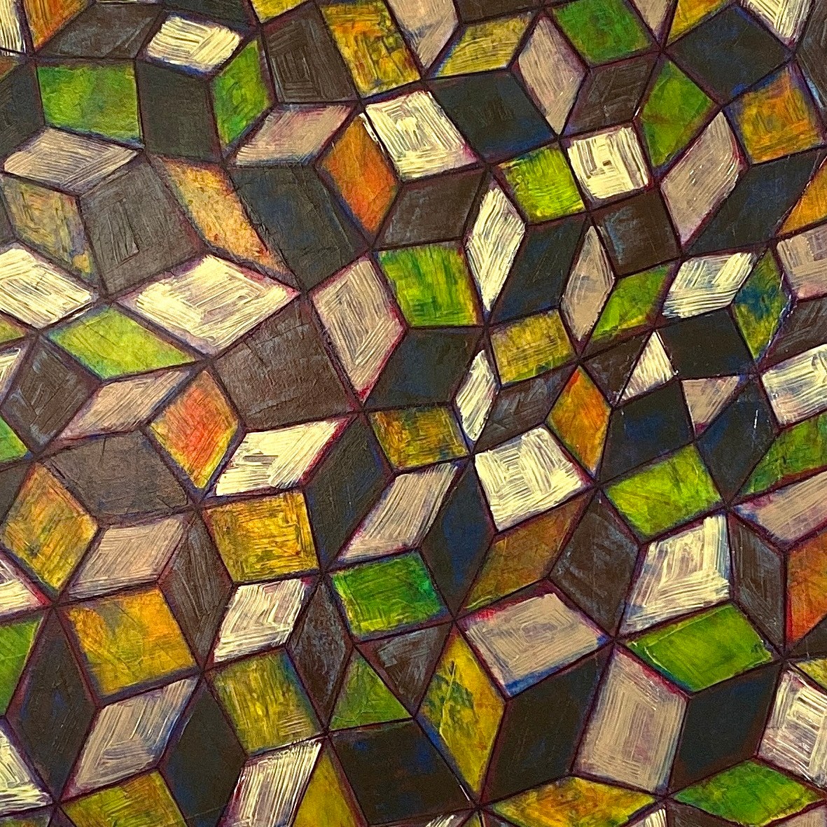


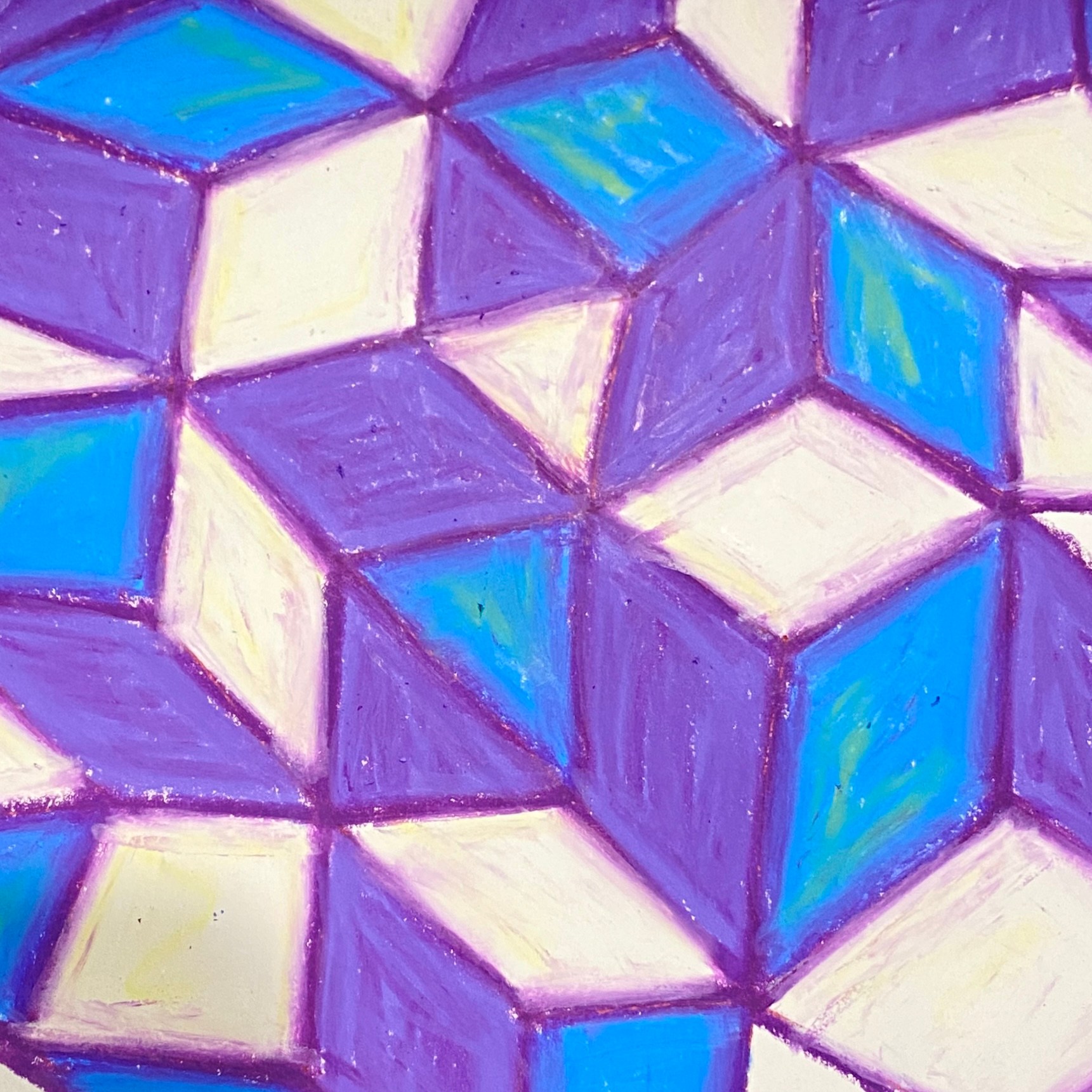
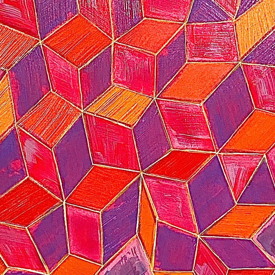


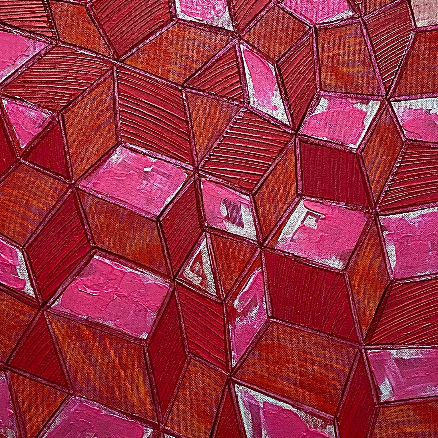
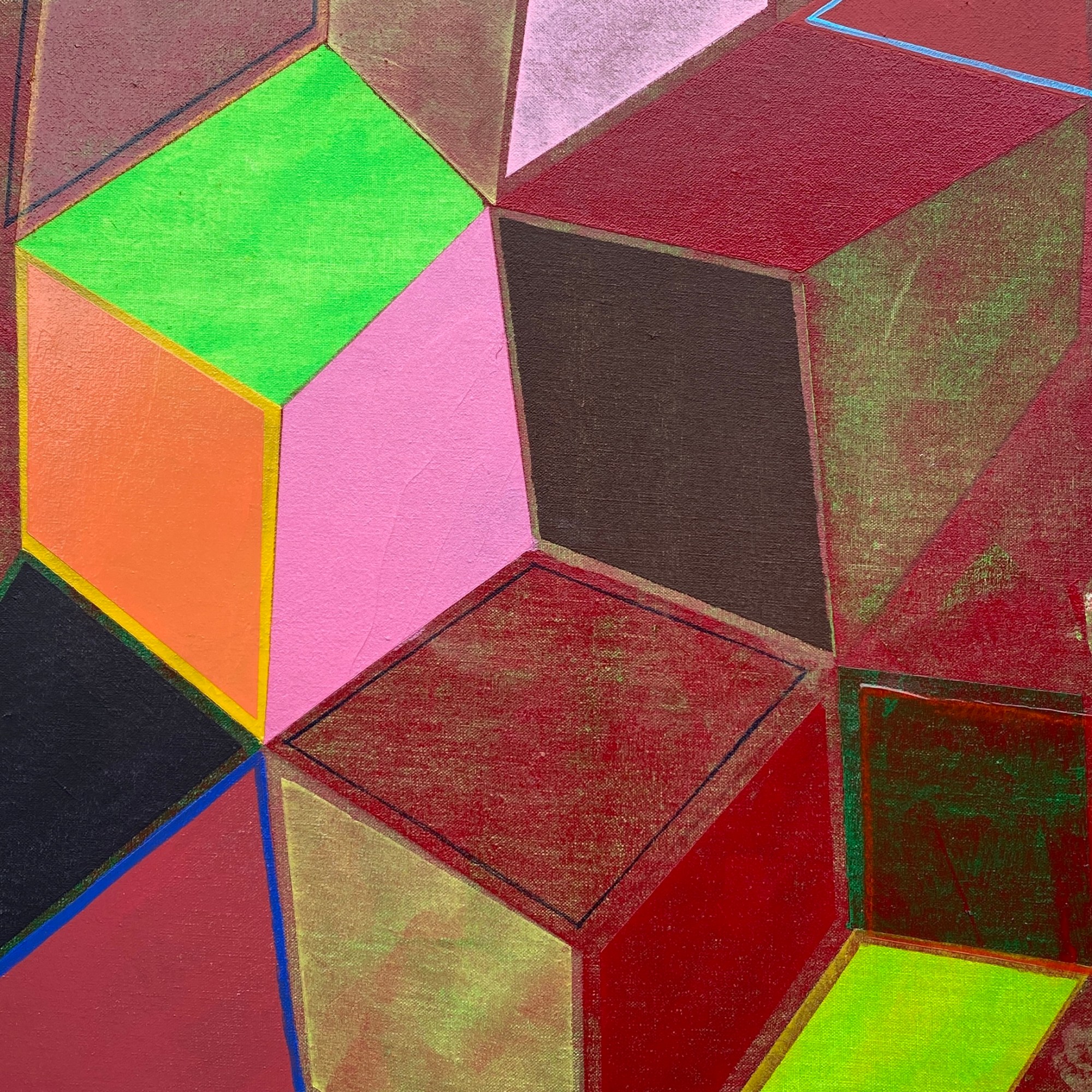

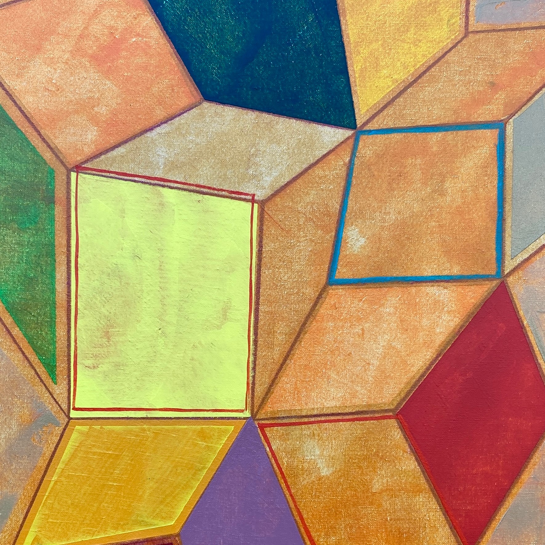

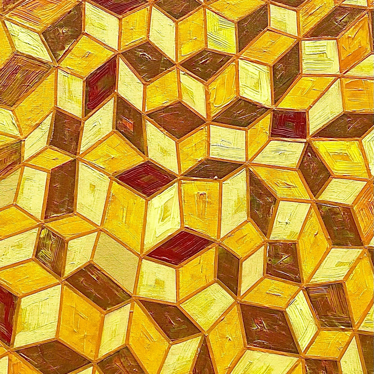
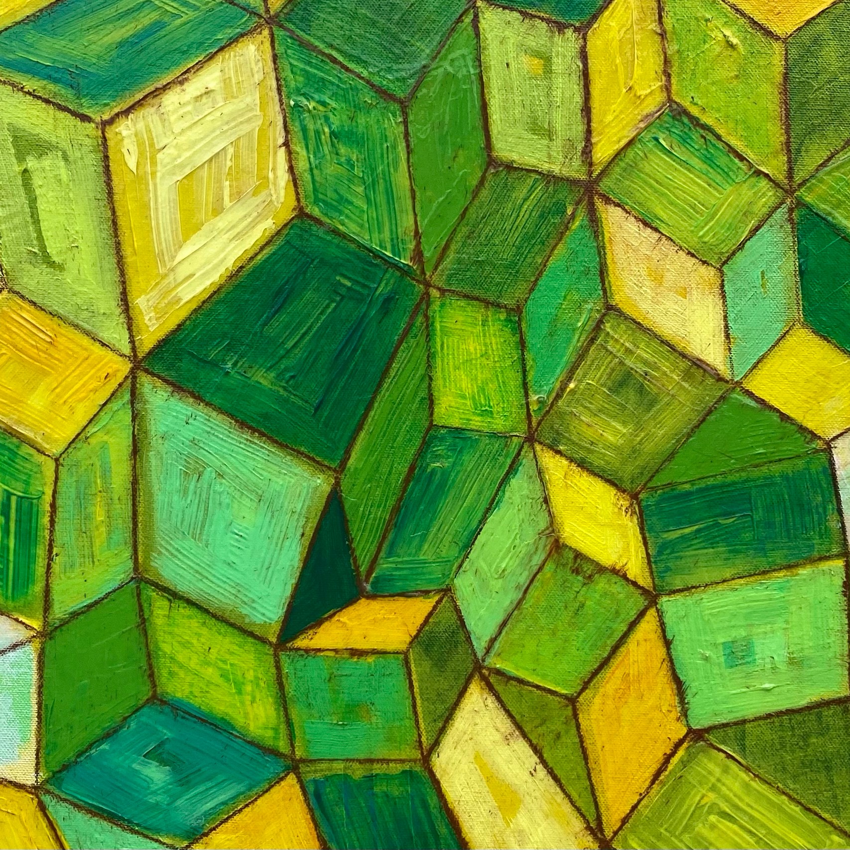

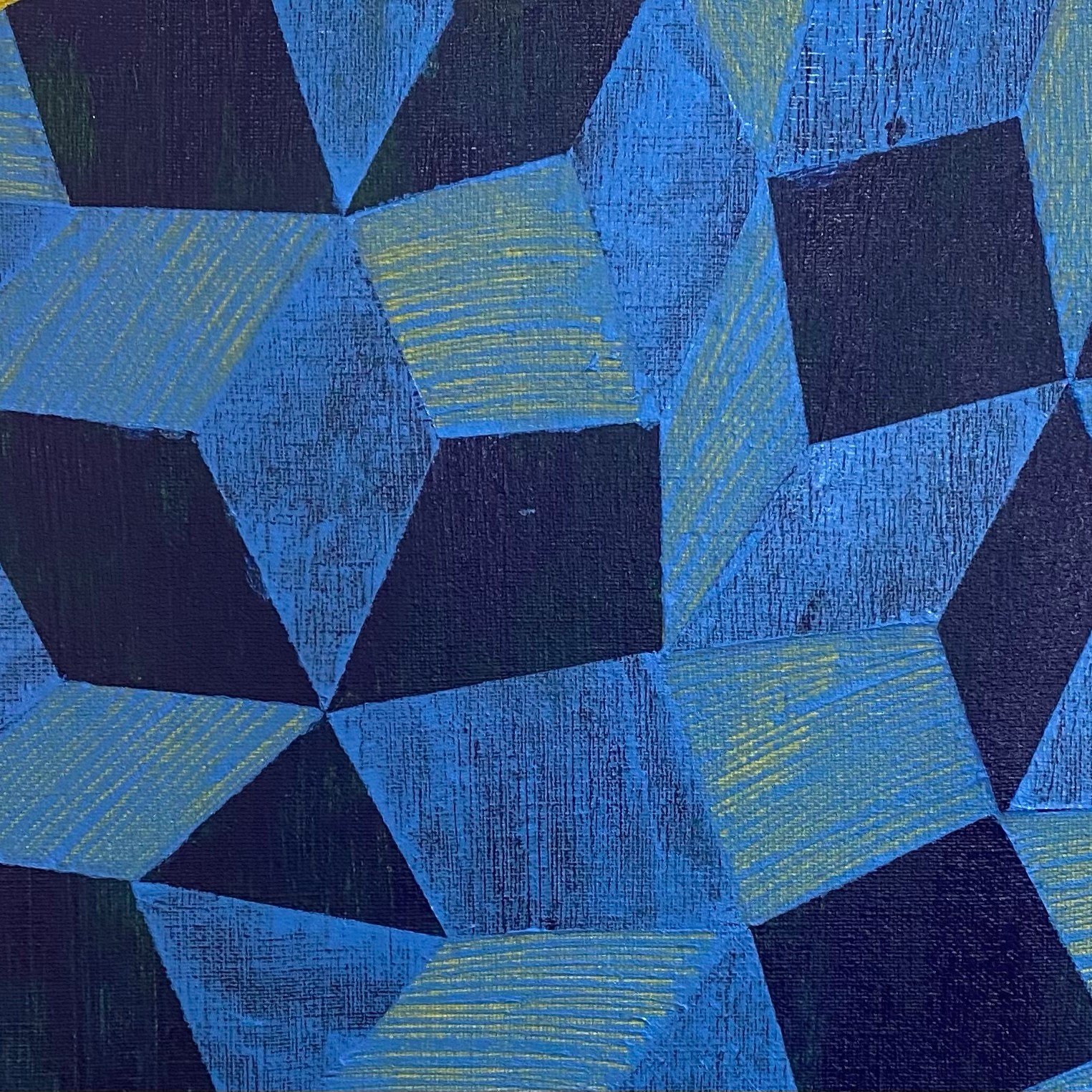


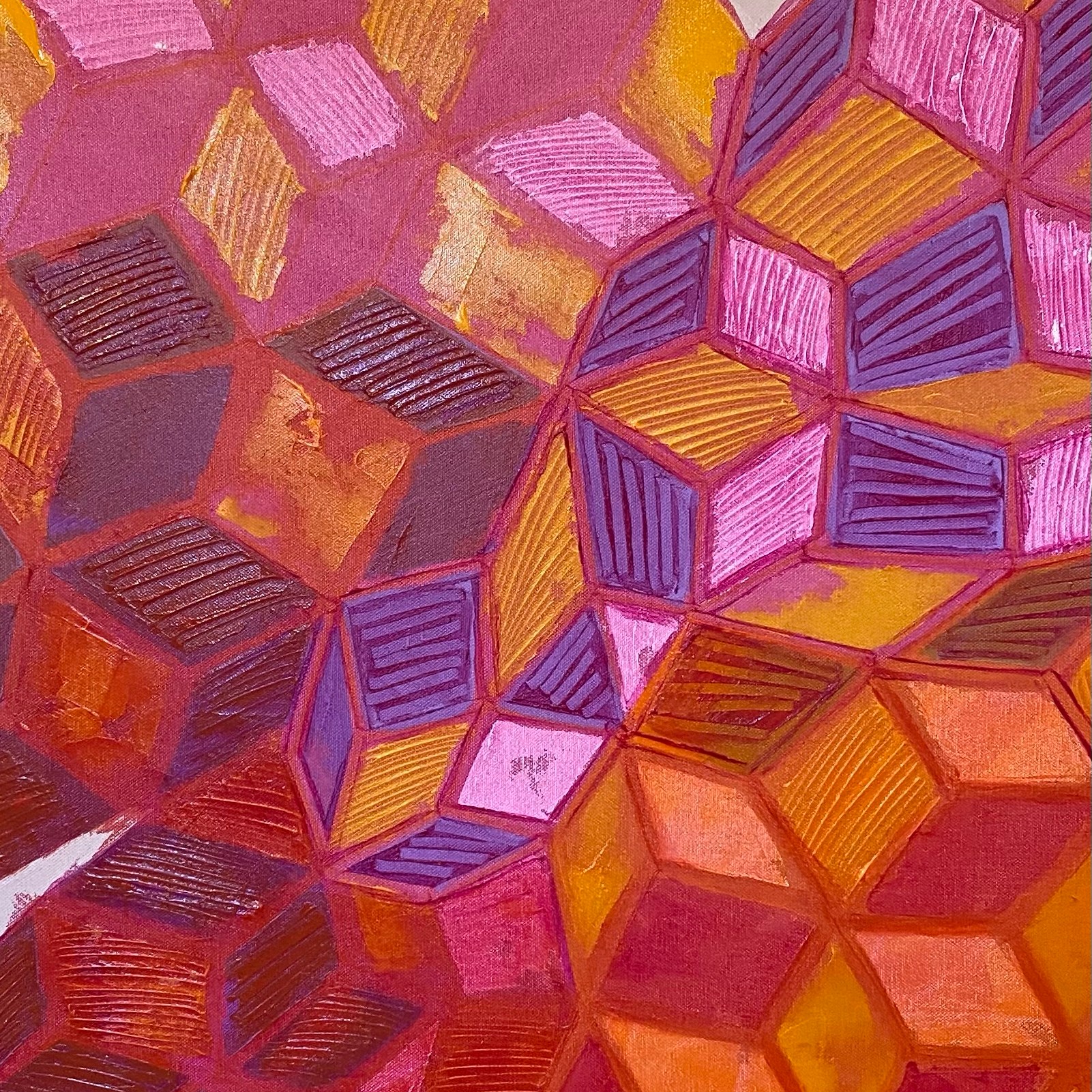

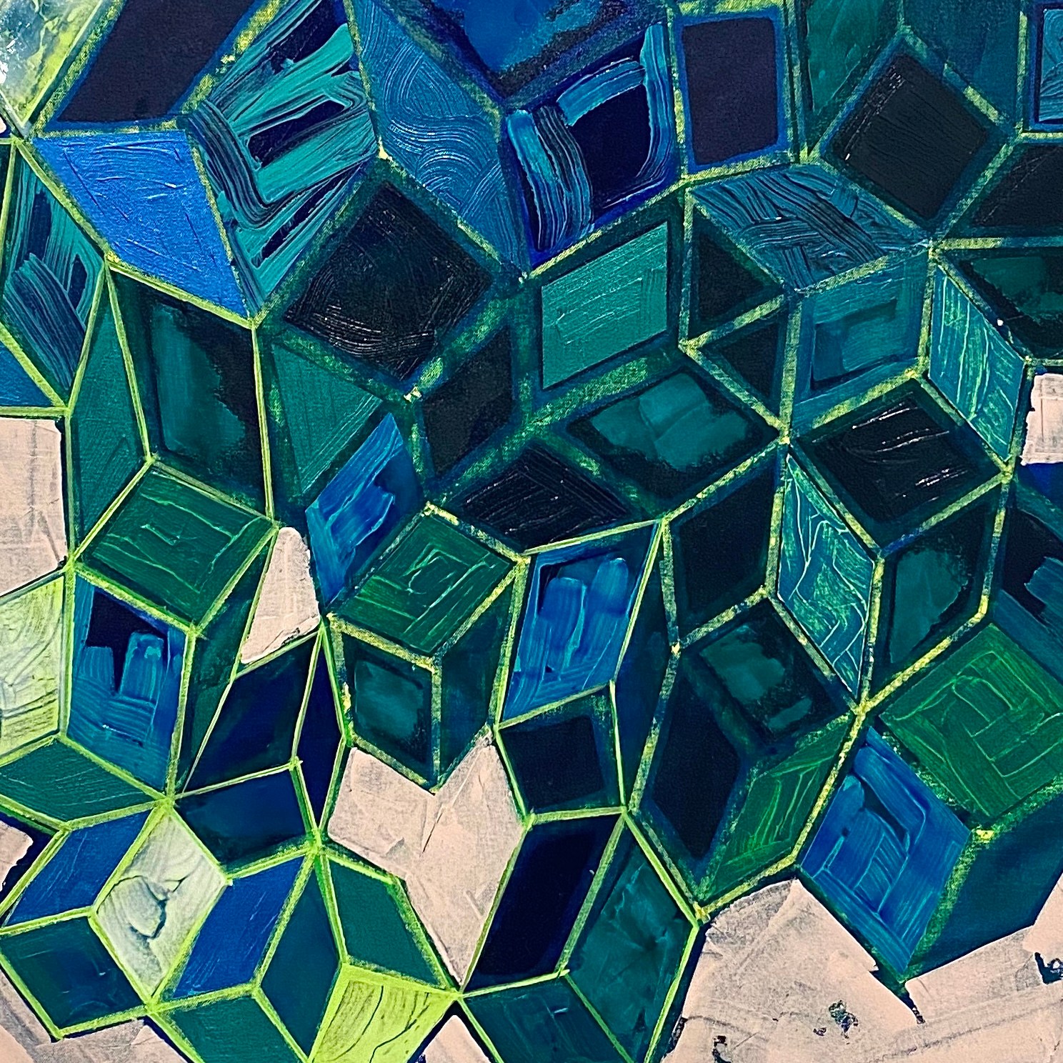
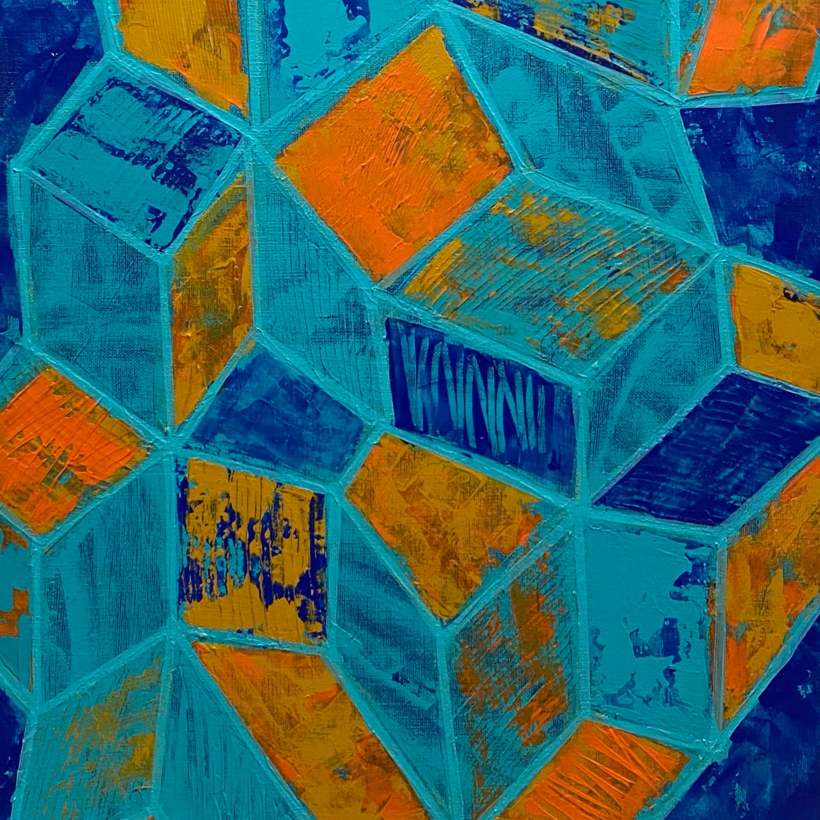
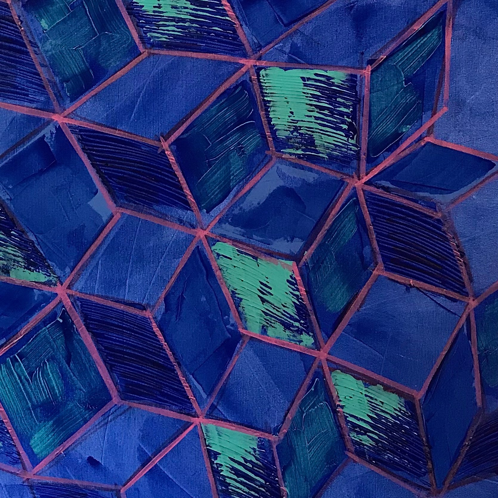
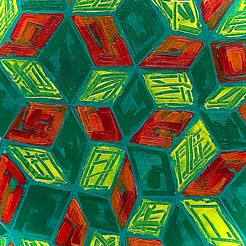
…and here’s the Modernist work.


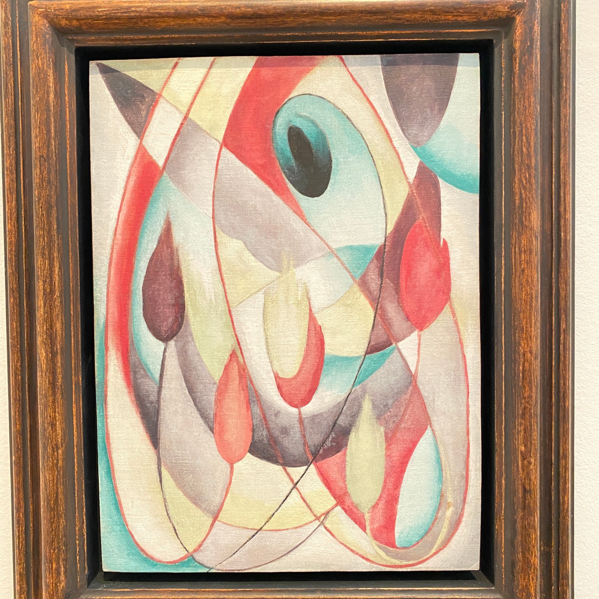


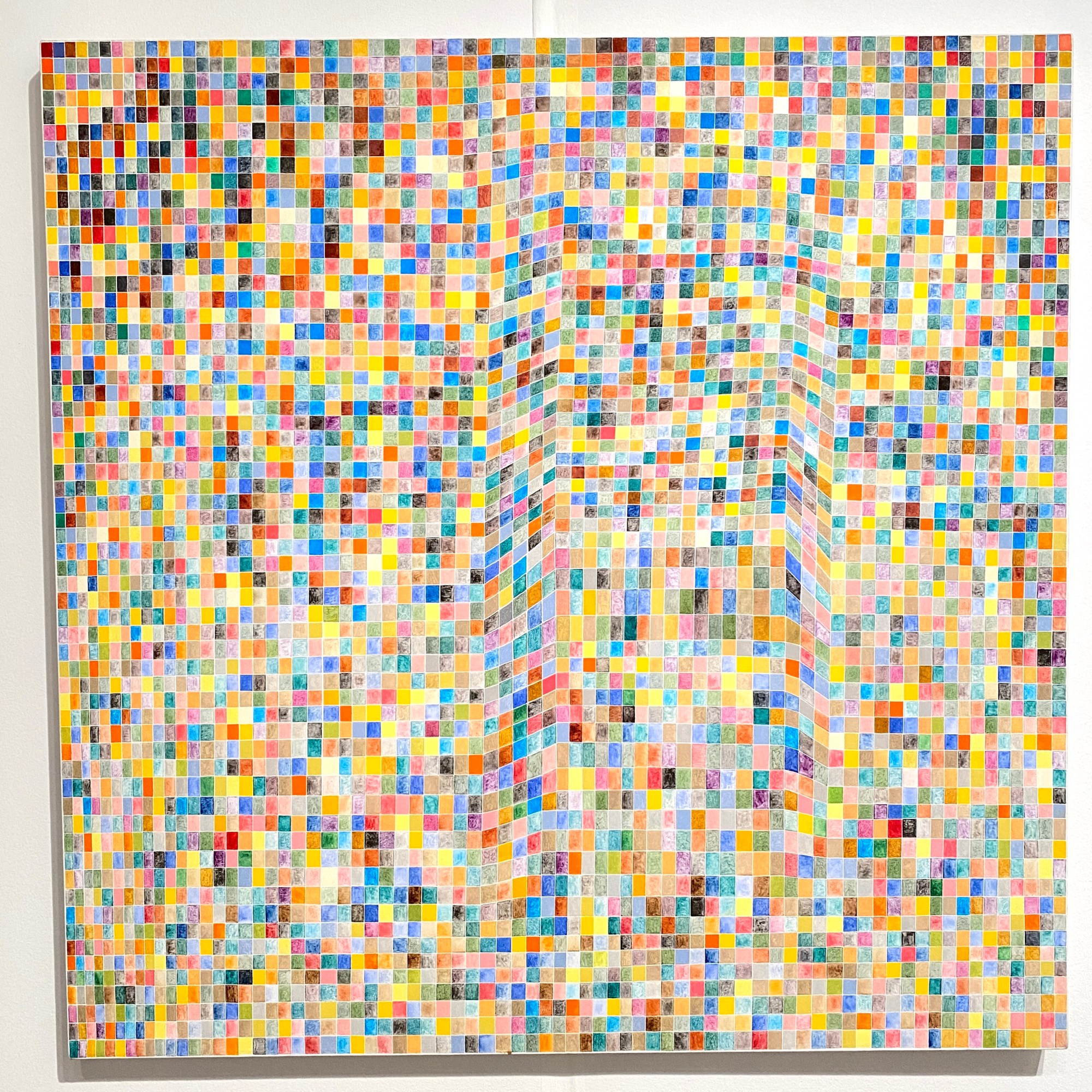
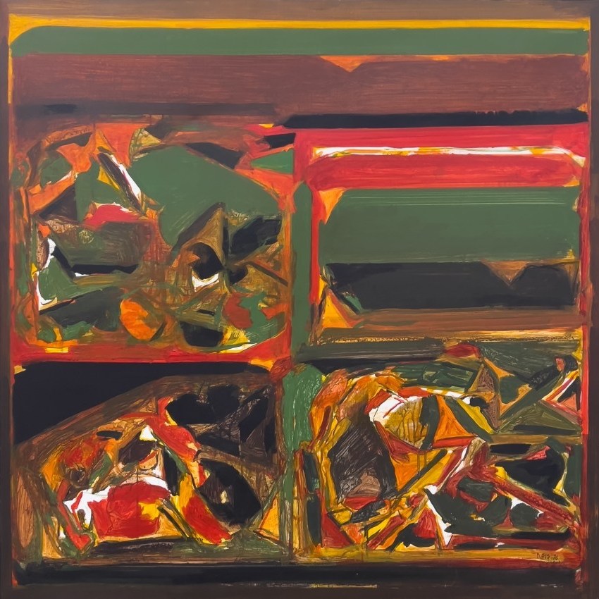


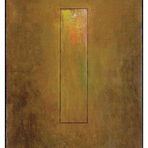
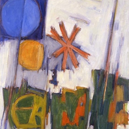


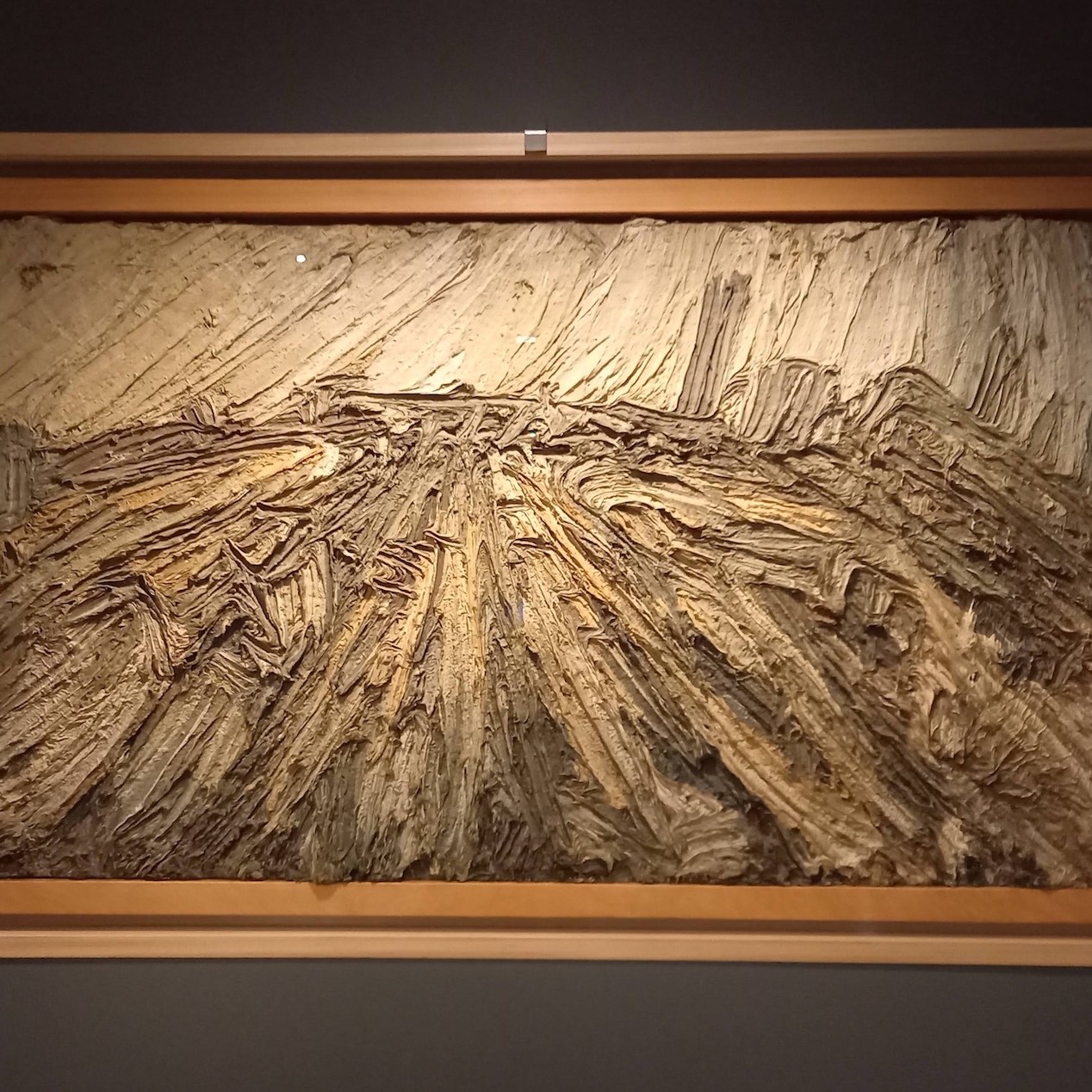

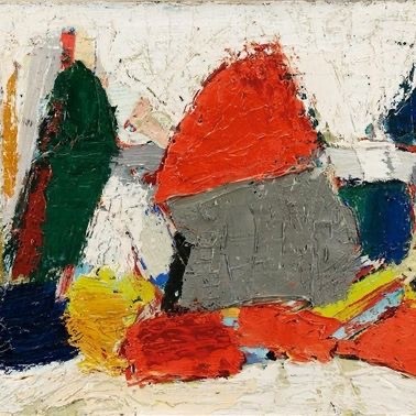


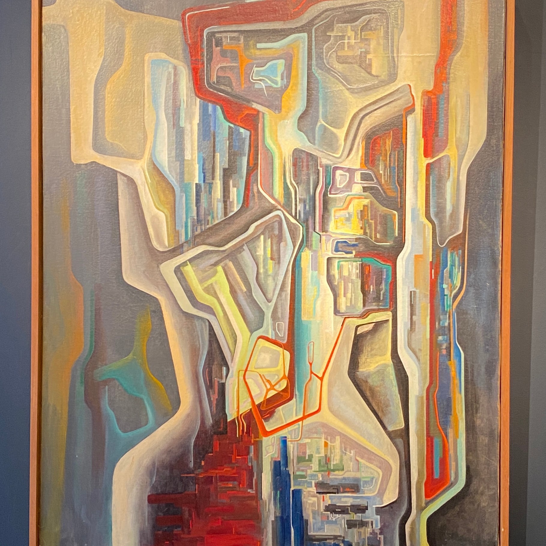


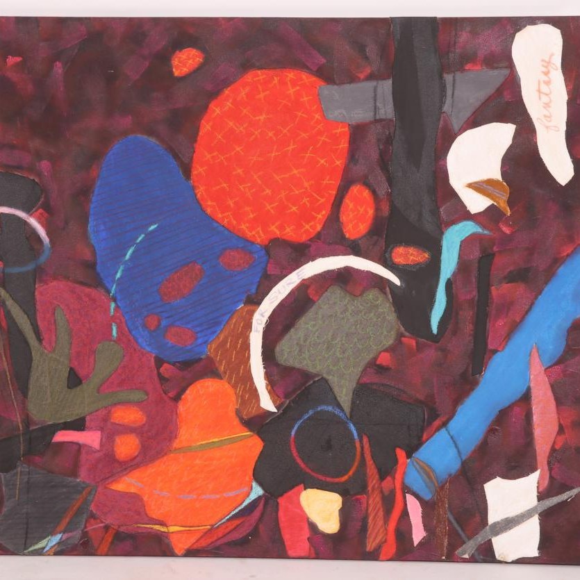
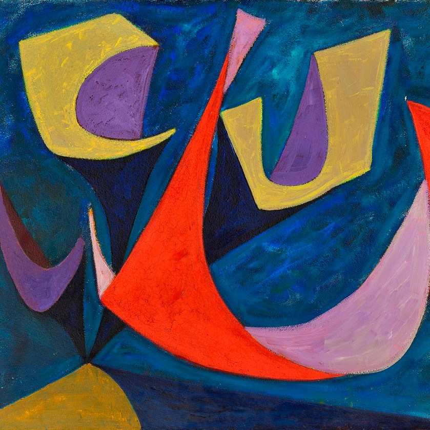
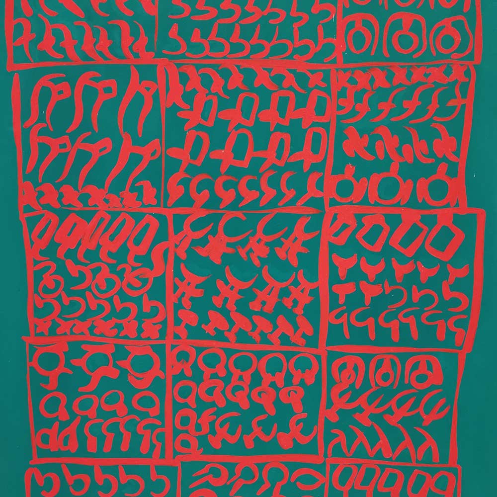


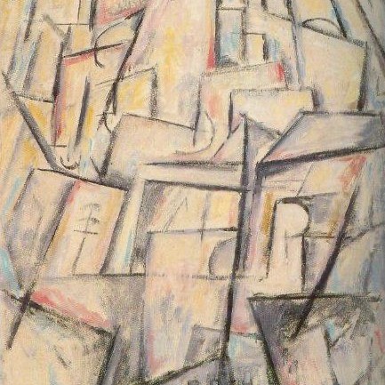
A few things pop out- a lot more blue in my work, a lot less browns and definitely less white (my hues are more saturated in most cases). I’ve worked with bold colors before, intentionally choosing high key ones that reference ’80s video games and cartoons. At the time I would have said bourgeois escapism, generally, was a theme, which doesn’t land in 2023 like it did in 2000- in particular in light of this recent Jonathan Stevenson article over at Two Coats, which isn’t critical of nostalgia so much as noting that when it’s romanticism full stop it’s “dumb.” My view of and interest in Modernism is definitively not romantic. I am interested in relevant ideas, like the parallels with today to another, earlier time when change became clearly necessary, and in how the notion that the artist did not owe anything to history became prevalent. Though I wouldn’t call myself or my practice activism, I am also, when possible, engaged in using the teaching of this period as a way to address and decolonize the more problematic aspects of many of the creatives and thinkers we traditionally center in this epoch.
I’m not sure where I’m landing to be honest- I generally try to avoid making abstract paintings that are representations of ideas (including ideas about cultural origins of certain colors) because of my concern that the work then becomes nothing more than a codex. And I’m not worried any way- I know mechanically that I’m competent to create any color I chose (I teach color) and I’m quite certain I don’t work my work to ever “just” be an exercise in flexing on some color theory. More recently I’ve begun to look for more “oooh/aaah” in my painting (please go see my newest, “left” and “Fragmented Prism”, in Open Source at Lump), so there’s nothing likely to change about my gravitation towards high levels of saturation.
2 thoughts on “Color…”