Mostly writing this blog to capture some things I’ve actually already posted on Instagram, and as a placeholder for these ideas so I can refer to them in future blogs. I continue to make works using several layers of reused glass and also recycled wood, and the titles of the work have also begun to take on some layers themselves. Noteworthy, perhaps, is that the work always precedes the title and proceeds without one- as I’ve written before, words are about words, and titles are the way artists communicate through words (well, that and artist statements).
The forms are also still, I think, making a pretty direct homage to Modernism, which I’ve written about in some detail and for those who missed the article linked above I’ll note I’m generally interested in parallels with today (2025) and the early twentieth century and also the opportunities created by referencing Modernism to engage discussions about both these two contexts. The inherent contradictions of what that epoch brought us, specifically ideas about universal humanity which were both valuable and necessary, and a denial of the value of diversity and personal, lived experience, are also of interest.

This is a recent work in progress that I’ve tentatively titled “Peridot/inner radiance.” I’ve been looking at minerals and precious stones as sources of title material lately, in order to tie my work my closely to Josef Albers.* I find one of his more inspiring quotes to be “Easy to know that diamonds are precious. Good to learn that rubies have depth. But more to see that pebbles are miraculous.”
Peridot is the rare gem-quality variety of the common mineral olivine, which forms deep inside the Earth’s mantle and is brought to the surface by volcanoes (unstoppable geological change). Wikipedia notes that “Peridot has been prized since the earliest civilizations for its claimed protective powers to drive away fears and nightmares, according to superstitions. There is a superstition that it carries the gift of “inner radiance”, sharpening the mind and opening it to new levels of awareness and growth, helping one to recognize and realize one’s destiny and spiritual purpose,” which, yeah, I’ll take.
Also this is also another piece (like departure from the main topic) intended to be viewed in normal and ultraviolet light so “inner radiance” is on point.
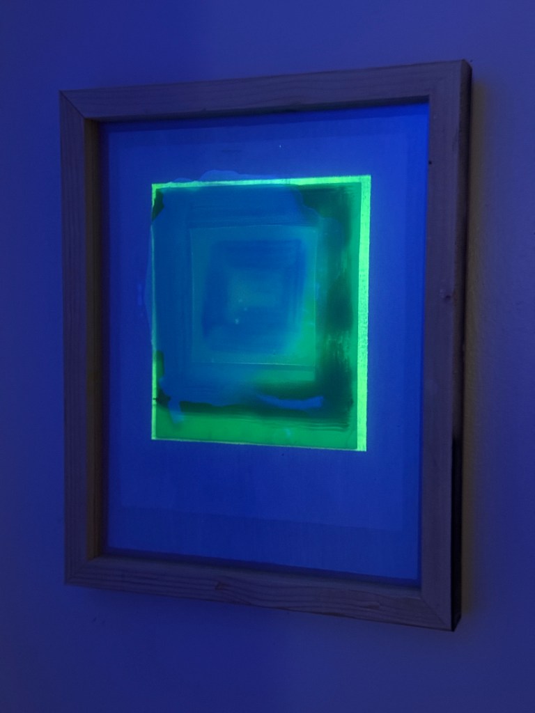
Turquoise is an opaque, blue-to-green mineral that is a hydrous phosphate of copper and aluminum, with the chemical formula CuAl 6(PO4)4(OH)8·4H 2O (which is the title of the work).
The reference to turquoise also intends to point at Alber’s quote about gems and stones. And- the Modernist ethos was highly deferential to science, as the changes in the arts were concurrent with rapid changes in the importance and value of science. The title is clearly scientific in origin; and, the importance of science to finding our way through this moment in history is uncontroversial and undeniable.
“Turquoise hydrogen” is produced from natural gas using a process called methane pyrolysis. It can be produced with renewable energy and is considered low-carbon intensity. And of course, the support materials are glass and wood that are scavenged construction waste, which means they are diverted from landfills. Organic material (such as wood waste) in landfills creates the greenhouse Methane, so the work has a symbolic if small impact on such. It would be great if the titles of the pieces inspired viewers to learn more about decarbonization strategies generally.
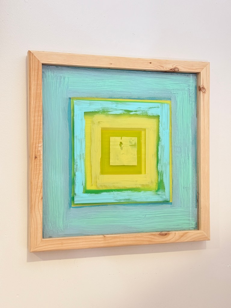
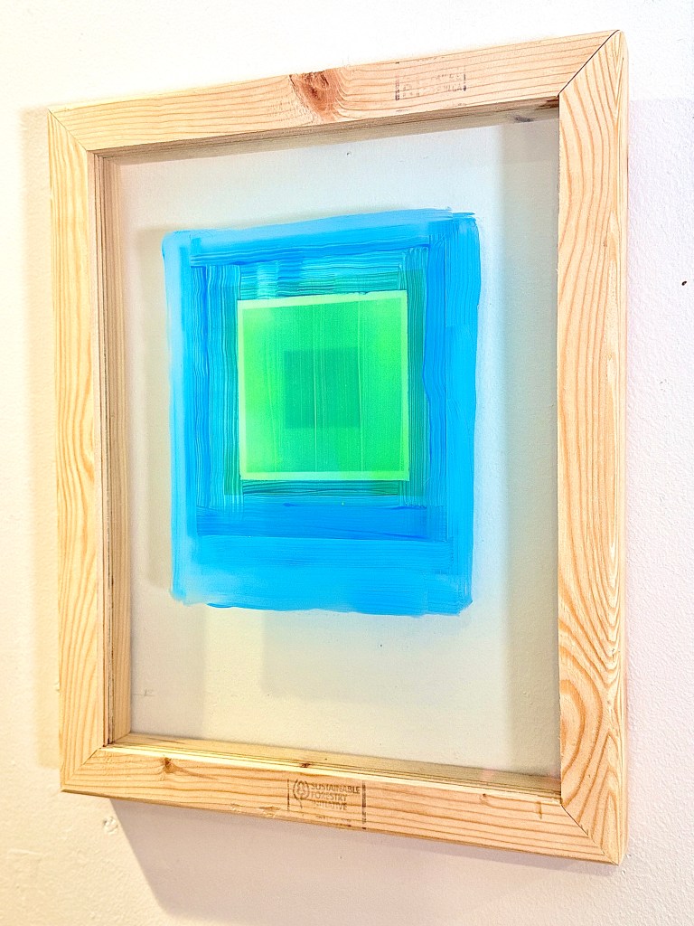
The working title of the piece below is “bluegreen.” Part of the reason I like this title is that the results you get when googling for “things that are blue green” seems almost endless. The phrase blue green often refers to proponents of eco-capitalism. The sustainable forestry initiative logo that remains on the bottom of the frame definitely impacted this title choice. I’ll let readers do their own research on this topic (link is to Wikipedia). I will note that the book Natural Capitalism had a lot of influence on my decision to work in sustainability for the last two decades, and my continuing belief in the value of implementing concepts like internalizing externalities (through markets for environmental attributes) and full-cost or “triple bottom line” accounting (that values communities and the planet at the same level as capital) and genuine progress indicators (as an alternative to GDP). Probably goes without saying that working to achieve social and environmental justice inside a capitalist structure has lots contradictions.
*My inclination to point in the direction of Albers has lead to many interesting conversations. I’ll continue to pursue it for several reasons outside of the nod at Modernism. One is Alber’s general preference for flat media (prints and paintings) and the contradiction in exploring the motif, but through objects. Contradiction has been an important theme to me for some time. I am also attracted, outside of the nod to Albers, to the notion of how infinite a shape like a square or rectangle can be, in terms of what an artist can do with and inside of it- it goes on and on and on. I love the idea of a through line, which was very center to my prior body of work (which I will be showing this summer in a show actually titled and, and, and…).
The other is an idea I’ve held for some time, though perhaps never written about, that artists have a hang-up about work that hews close to an ancestor or influence that our peers in music don’t have. Said differently- what jazz musician worries about whether their influences show, or even whether they can play a song written by another and not bring something new to it? Why artists actively trip ourselves up on this sort of stuff is literally beyond me. Related to this, and why I’m comfortable with high visibility of Albers as an influence, is that musicians and music fans also don’t have hang-ups about liking the work they like- my work is for people who like abstract painting. There’s no invective there, I’m just doin’ me for people that I f&ck with, full stop.
I also want to give a shout-out to Steve Locke who is also developing an on-going body of work that points at Albers, with different intentions. If you know of others, dear reader, please leave me a comment! Also, and- if you like simplified forms and live or are traveling to NYC, please go see Light on my behalf.
